
Website Design Services is a diverse and fast-evolving domain. New website design trends reflect emerging tech innovation in both the hardware and development side. This gives designers more room to experiment and push the limits of storytelling on the web. In this article, we can explore where design stands today, and where it is headed in the near future. We hope that the list inspires you and helps you spark your creativity.
-
Brutalism:
Brutalism is a classic example of anti-design. It seeks to go beyond the classic design principles and incorporate chaos in designs. More often than not, the lack of rules can make brutalism look like bad design. Common characteristics of the brutalist design are asymmetry, broken hierarchy, bold typography, overlapping elements and bright colours. Brutalism gives designers a level of creative freedom which is rare in other website design trends. There are pretty much no rules to follow. All this might make you think that it’s easier to design brutalist interfaces. But brutalism still requires a lot of understanding of the same laws you are supposed to defy. You have to keep in mind that the line between brutalist designs and poor designs is very thin and blurry.
-
Micro Interactions:
Micro-interactions are simple and small animations that are triggered either by the user or the system. Despite going unnoticed a lot of the time, these animations still play a pretty significant role in enhancing user experience. That goes perfectly in line with the definition of good UX. The UX is at its best when it goes unnoticed. Well-designed micro-interactions are the kind of details that differentiate between a good product and a great one.
-
Aurora Gradient:
Aurora gradients go well with most other modern website design trends like Glassmorphism and Minimalistic design layouts. Unlike traditional gradients, aurora gradients are much more subtle and blend in with the background giving them a very natural muted look, just like Northern lights. Despite the subtleness of the design, aurora gradients can make the UI look much more engaging, or even nudge user attention to the CTA of your website.
-
Neumorphism:
Neumorphism is a style born with a combination of skeuomorphism and modern minimalism. Gaining more and more traction over the past few years, a lot of designers are recognising this as a sweet spot between the complexity of skeuomorphism and minimalism of the flat design. Despite its widespread use on Dribbble, we are yet to see many big brands getting behind this trend, this might be because of some common accessibility issues with the style as maintaining contrast between different elements is tricky.
-
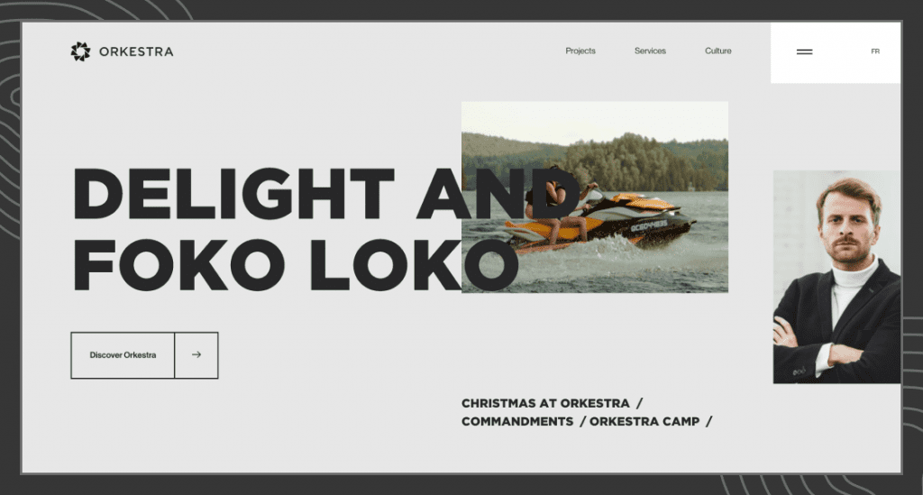
Asymmetrical/chaotic layouts:
Asymmetrical layouts are another result of the anti-design movement. Just like Brutalism, Asymmetrical layouts don’t follow the conventional grid and balance rules. These layouts still adhere to most other design principles which set them apart from the brutalist style. These designs sit perfectly between the anti-design movement and classic web design principles. Anti-design movement itself started because designers and users alike got tired of most mainstream designs looking way too similar. Brutalism, in my opinion, is way too chaotic to become mainstream, giving way to something more relatable, but still unconventional.
-
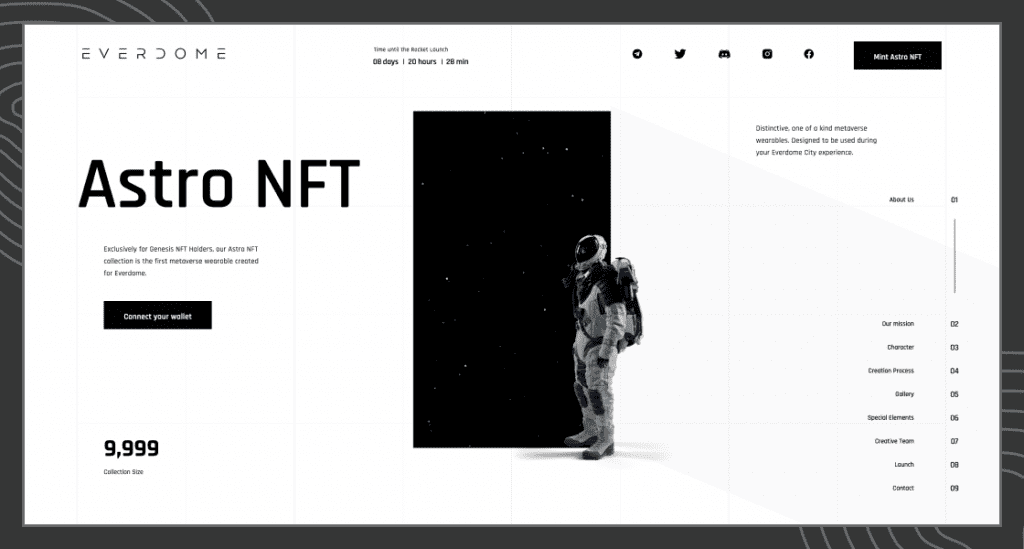
3D graphics:
Not a very new trend but 3D graphics are increasingly being used on the web. A lot of this can be attributed to increased access to 3D designing software like blender and more powerful client machines to handle such websites. With the emergence of the metaverse, we will be seeing more of these websites. Both static and interactive elements are increasingly using 3D graphics. eCommerce is one of the avid users of the technology to give potential buyers a more immersive product experience before they buy. Apart from eCommerce, 3D is still a novelty for which limited few industries have found practical uses. Soon, more industries will adopt 3D as it gets easier to create and integrate 3D content. Even if it’s not the most practical way to go a lot of the time, it’s hard to counter the magnetism of 3D graphics.
-
Skeuomorphism:
While there are newer versions of skeuomorphism (Neumorphism), the real deal is not going anywhere. Humans will always take inspiration from the real world around them to create their digital world. Metaverse is an excellent example of it, while there were advanced tools available to interact online, we had to create something that feels closer to real-life meetups. Skeuomorphism is making a comeback with hyper-realistic 3D imagery, VR and AR. Digital museums and art galleries constantly attempt to replicate the layout of their brick-and-mortar counterparts.
-
Glassmorphism:
Glassmorphism requires a multilayered design with the top layer having a look of frosted glass. The effect works well with colourful and sharp backgrounds which emphasise the frosted glass effect. Microsoft is one of the avid users of glassmorphism when they implemented it in windows vista and called it windows aero design. In the latest version of windows, Microsoft incorporates glassmorphism in “acrylic material” which is a part of the Fluent Design System. Apple too embraced glassmorphism in iOS7’s designs in 2013 and continues to use it in Big Sur MacOS. This adoption by big brands gave a substantial boost to glassmorphism.
-
Bauhaus Style:
Although a very old design trend, Bauhaus is making an impact on digital designs in the past few years. The Bauhaus design philosophy is a classic example of form and function, thus making it a go-to style for sophisticated and tasteful crowds. The Bauhaus movement championed geometric shapes, primary colours and clean lines. The designs use little to no decoration in said shapes. That is because geometrical shapes themselves are the decoration while being functional parts of the product.
-
Dark Mode:
Dark UI had its beginnings in old monochromatic screens. We didn’t see them for a long time in mainstream UI designs as display hardware evolved. Over the past few years, users are leaning towards darker UI because it is supposed to reduce eye strain. Whatever the health consequence or benefits may be, it’s hard to argue with the slick feel it provides to the UI designs. Brands like Netflix, Steam, discord and Prime-video are using dark mode as their standard theme. A lot of utility web app UI UX designs are including options to switch dark/light themes as per user preference.
-
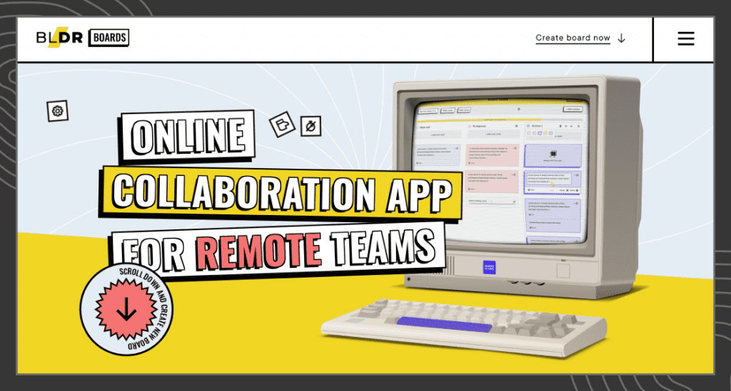
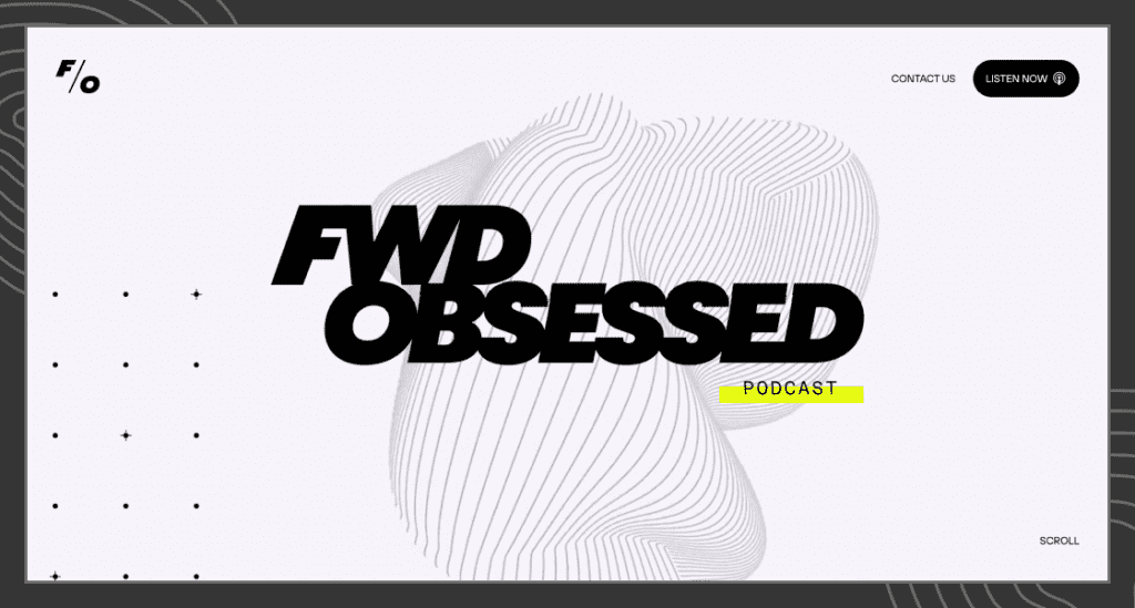
Bold/Loud Typography:
These are the designs where typography takes the center stage. Often the typography is making a statement that designers don’t want users to miss. Designers have to make sure the type is big and bold without coming across as too aggressive.
-
Typographic overlap:
Typographic overlap can just be an extension of Bold and Loud typography competing for space with nearby elements. The overlap can establish dominance and depth in a rather flat UI. Often used with parallax, these layouts can be cluttered but still look stunning. Just like other unconventional website design trends, typographic overlap flouts the classic design rules. Making it a tricky one to get right.
-
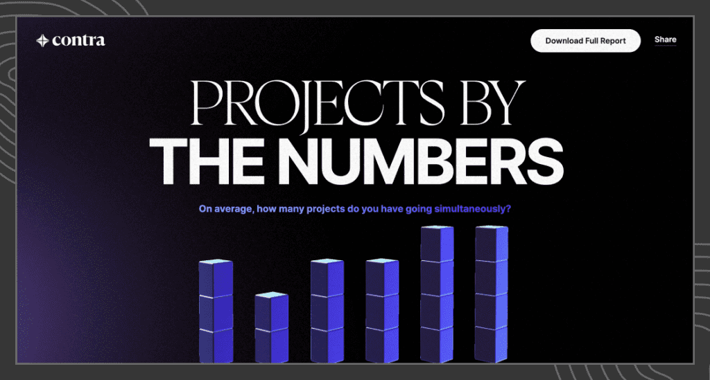
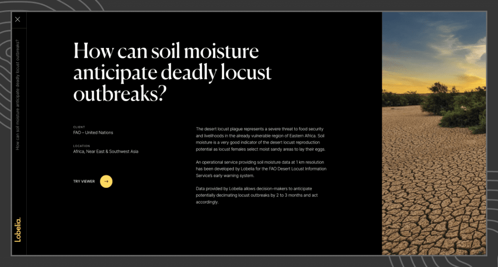
Data Visualisation / Information Design:
”In God we trust. All others must bring data.” the quote by W. Edwards Deming well summarises the importance of data in the modern world. The Digital age is data-rich, where data holds meaningful insights. A well-designed data visualisation can tell captive stories which are intuitive and don’t require the user to spend much time to understand the narrative. Unlike most other website design trends, this one is most likely to stick around. One of the great examples of communicating complex stories with data is the “State of independence 2021” report.
-
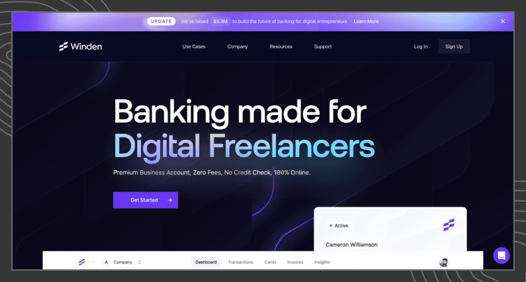
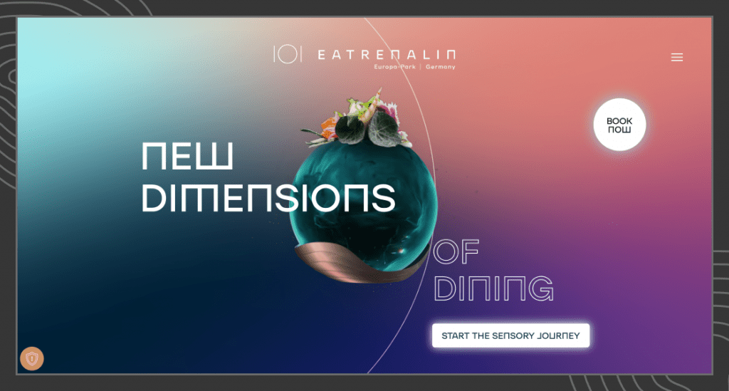
Complex Gradients:
Gradients are as old as graphic design, as the flat design trend took over, gradients fell to the wayside. The newer implementation of gradients is a bit different from what was being done earlier. Rather than standard linear and radial gradients, today complex multi-colour blends are a common sight around the web. You can take these gradients one step further and animate them to add life and emotion to your designs. Complex Gradients are also called mesh gradients and there are tools available to replicate them in CSS.
-
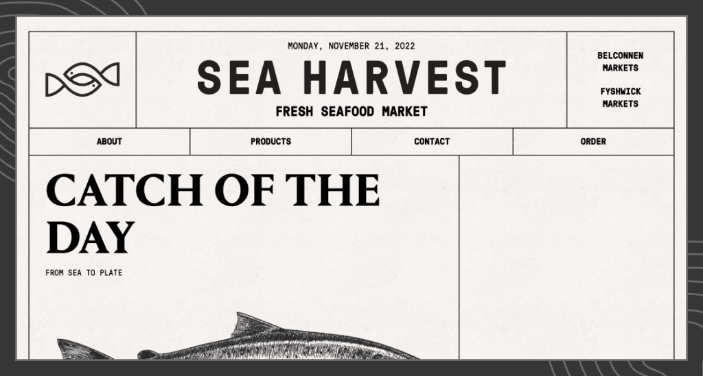
Retro UI:
There are multiple variants of Retro UI, there is one where you can find vintage looks or the ones which give you 90’s nostalgia. The vintage style of UI is often in combination with earthy tones and gives the feel of vintage magazines. Simple arches and rounded shapes are almost exploited. On the other hand, Retro UI’s which try to emulate 90’s aesthetics, tend to favour more geometric and harsh shapes along with grunge and textured backgrounds. Vintage style seeks old sophistication but on the other hand, 90’s retro style is rebellious in nature.
-
Neon:
This might be one of the most recognizable and hard-to-miss website design trends. There is no better way of making an intense visual statement than to use neon colours on dark background. The initial inspiration came from neon signs in the 1920s all the way to the 1950s. Even today people associate neon with futuristic designs. We may derive neon colour by brightening (extremely bright) any colour falling on the visible spectrum. Neon aqua is the brightest of the colours that are in use but if you want to make something pop using neon colours, neon green will do the trick.
-
Monochromatic designs:
A colour palette is one of the most important design decisions designers make while working on a project. Monochromatic style can produce a very clean and simple appearance. Most people think of black and white designs when we talk about monochromatic, but it can be any other colour until you stick with a single base colour and shades, tints and tones of that hue. Monochromatic designs usually derive colours from the branding and help establish brand recognition throughout the website. Not to mention the psychological value that colours carry with them can help set the tone.
-
Kinetic typography:
Kinetic typography usually establishes a narrative by using creative motion design on text. Kinetic typography is a useful tool for user engagement because anything that moves is really hard for the human eye to miss. It’s one of the most effective and creative ways of getting user attention on your primary message. The ability of kinetic typography to grab attention and evoke emotions in a short space of time is undeniable. The combination of motion and text is one of those website design trends that existed long before the web existed itself.
-
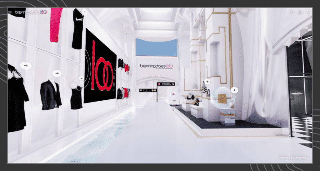
Virtual and augmented reality:
Big tech is pushing for an alternate reality as the next big thing in the human-computer interaction realm. VR and AR might not take over every industry and vertical all at once, but we can surely see a vast amount of opportunities in certain industries like Education, Gaming, Real Estate and eCommerce etc. We can capture these visuals using 360-degree cameras and also recreate them in 3D modelling software.
-
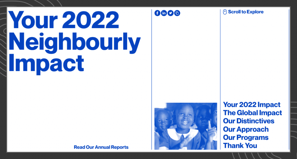
Horizontal Scrolling:
Horizontal scrolling websites provide an offbeat experience for the user. This unusual format makes the website way more memorable and fun. The trend initially started when a secondary piece of information had to be unveiled, only when the user needs it. For example, a user can scroll vertically to find the relevant category, and then scroll horizontally to explore the contents of said category. Today, the trend has evolved to full-page horizontal scrolling as the only option. This might look unique, but designers should be careful about the UX implications of these layouts. Horizontal scrolling defies the user’s expectations and may leave them confused. Full-page horizontal scrolling is one of those website design trends that big brands usually stay away from. Despite all the drawbacks, you can find examples of great websites with sideways scrolling.
Conclusion
While we see new website design trends come and go every other day on Dribbble, we should keep in mind that the core principles of design are timeless. Some website design trends might stick around longer than others, but most eventually fade away. One shouldn’t follow every design trend you see on Dribbble because that might make your designs have shorter than intended shelf life. Every design choice you make should have sufficient enough backing that quantifies it. Only because it’s trending is unfortunately not a reason big enough to make most design decisions. This doesn’t mean you shouldn’t experiment with your designs. Experimentation is a vital aspect of creativity and innovation in the field of UI UX web design. All this shouldn’t deter you from experimenting with your designs, be cautious of the risks you are taking with new website design trends and how that might affect the quality of the products you are designing.
Be the first to comment.