

UX designers often have to present quantitative data to the users in a comprehensible and engaging manner. It is crucial that you as a designer understand the basics of data visualisations and adhere to the best practices for creating dashboards and data-heavy interfaces.
What is Data visualisation?
Data visualisation is the representation of dense and complex information in graphical format. The result is supposed to make it intuitive and easy to spot trends, progress, make comparisons and find relationships. Data visualisation is one of the most functional art forms.
Types of Data Relationships.
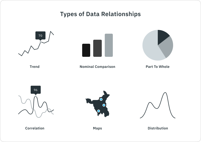
1. Trend: trend charts show the variation in data over time. The trend charts usually have one of the axes dedicated to time and the other to value. Example: Population over the years.
2. Nominal Comparison: Comparison charts are used to visualise the difference in values of various elements. These charts can also show ranking if values are sorted. Example: Countries with the most lakes.
3. Part to Whole: Most common part of the whole chart is the donut/pie chart. In these charts, the values are visualised as part of the whole. Example: Customers from different cities.
4. Correlation: When the statistical relationship between two values is visualised, the resulting chart is called a correlation graph. Example: Marks vs attendance of students.
5. Maps: Data visualisations where one or more values are geographical. Maps are simple and easy to relate data to geographical locations.
6. Distribution: The distribution of values along another numerical attribute is plotted using bars or scatter graphs.
Types of Charts.
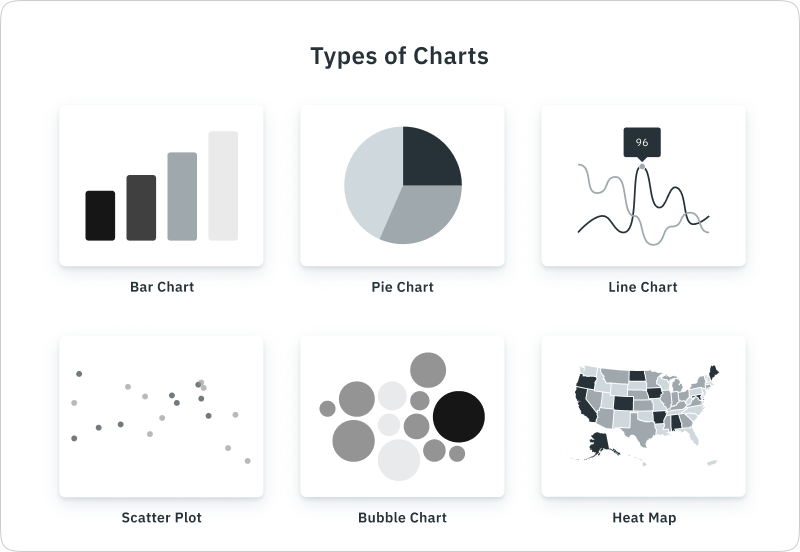
1. Bar chart: Bar charts are the most common way of data visualisation, these can be easily used to visualise multiple types of data relationships such as trends, comparisons and distributions. Hight of the bars is used to reflect the differences in values, making the charts easy to scan at a glance. One of the drawbacks of bar charts is that they can only be used to represent small to medium-sized data sets.
2. Pie chart: Pie charts are most commonly used to visualise part-to-whole data relationships. Each data value is assigned a single slice (or pie) of the circle, and differences between sizes of the arc are used to represent the difference in values.
3. Line chart: Line charts are used to show changes in value over a continuous time interval. Multiple lines can be used to add values, given the values share a context.
4. Scatter plot: Just like bar charts, scatter plots also uses a rectangular coordinate system with each axis representing a parameter. The location of points on a 2d surface determines their values for both available parameters.
5. Bubble chart: Bubble charts are used to compare 3 or more values with the size of the circles (bubbles). Bubble charts offer visually compelling charts that present large volumes of data at once.
6. Heat map: Unlike most other charts, heat maps use colour as their primary manner of data representation. The contrast in shades and colours results in intuitive charts capable of representing vast amounts of data.
1 comments