The design industry is embracing minimalism like never before. The philosophy of ‘Less is More’ inspires web designers to create minimalist designs.
Even so, minimalism can be a challenge. The main purpose of this blog is to explain the concept of modern minimalist web designs to create a better user experience.
What is minimalistic web design?
Different industries have different definitions of minimalism. A minimalistic web design has only a few elements, such as basic shapes, monochromatic primary colors, and so on. A minimalist approach promotes the less is more approach by eliminating unnecessary details, resulting in a faster loading user experience.
By well-organizing and thinking through the process, our design team for website design services makes it easier for content to stand out and becomes the prime focus of the website.
How should minimalist website design be approached?
There are various methods to approach modern minimalistic website design. Let’s have a look:
Use of Flat Design and Texture
Flat designs are timeless and efficient since they lack unnecessary shadows and gradients that create a glossy appearance. As a result, people can navigate efficiently. This format makes it easy to understand the results. Navigating through the site is easy with the help of clear text links and by highlighting CTA.

Ref: Mailchimp
Mailchimp is a popular email marketing tool that everyone is familiar with. The company iterates on its designs frequently. This version, however, has a minimalistic web UI.
Use Negative Space
Minimalist web design is all about using a lot of whitespaces or negative space. The spaces between the content are just as important as the content itself. With white space, it is easy to make a particular element more noticeable because all you need to do is to increase the negative space around it. Space will naturally direct the eye toward the object.

Ref: Apple
With Apple’s products, the visitor has only one focus at a time due to the use of white space. There are no distractions here.
Maintain Balance and Visual Harmony
To create a balanced design, you need to keep everything in check. One should understand how all the elements in your design work together.
For example, if you need a photo to balance with other elements such as typography, it can be helpful to look for ways to make it visually appealing. And you can do it by placing it near other elements that plays well with the photo, such as white space, text and color combinations.
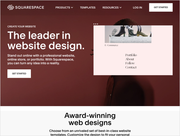
Ref: Squarespace
In Squarespace, alignment styles and colors are mixed and matched to create visual harmony and balance.
Use Limited Color Palette
Colour is one of the most essential elements in web design since it can establish vital relationships between the product and the consumer. When choosing your color palette, choose colors with enough contrast for users with poor vision or color blindness to read them. It is best to use accent colors deliberately and consistently to draw attention to essential information or primary actions.
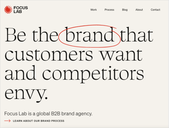
Ref: Focus Lab Agency
When we design for a minimalist website, you should only use colors that highlight your design. If you want to highlight certain elements in your website design, you can add a contrasting color to a monochromatic color scheme.
To understand better, go through our blog on The Psychology of Colors.
Understand Typography
Minimalist design is based on the use of white space, which is often referred to as negative space. Since the text is one of the few elements that can dominate negative space, it becomes much more valuable. Although typeface design is important but legibility is also a crucial function of typeface design. No matter what typeface you choose, always make sure it is readable. Font size, weight, and style all play crucial roles in the typography concept.
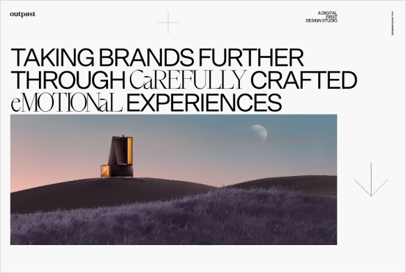
Ref: Outpost
The technique used in the above example to convey the message through typography is elegant. Reader-friendly typographic examples are the most brilliant. Moreover, it is more likely to work with fewer fonts but different font styles.
Use of Images
Images can help you to express your ideas clearly, whether it is used as a focal point or to create balance. A splash of contrast between two images can also help you to create a visually interesting composition. When you are trying to create a minimalist website, large and vibrant photos or videos can help drive your message home. Ensure that the images you choose are relevant or serve a purpose so that they do not distract from your content.
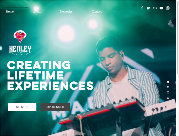
Ref: Kenley Events
Minimalist design strategies prevent other elements from competing with the background image when used for a carefully considered, strategic purpose.
Hero pictures and headers with vibrant colors is an example of modern minimalist website design. When they are used in media, they establish an emotional or contextual connection that sets the tone.
Examples of some modern and minimalist web design
Tinker
With its minimalist design, it blends into the photography, presenting the watches and conveying a mood at the same time. They have created clickable image cards with summarized information to direct them to all the crucial information on your website to encourage them to stay longer.
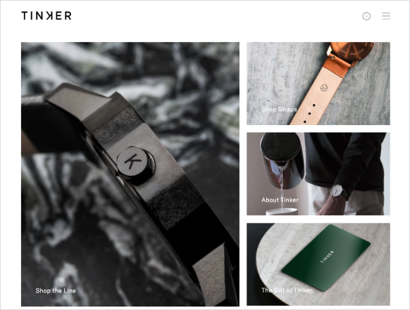
Tinker Watches
We Ain’t Plastic
Having a functional, well-designed website is a must for an experienced engineering firm. The story of We Ain’t Plastic is told through high contrast, bold design, and concise writing.
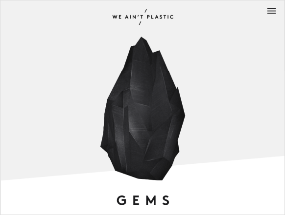
We Ain’t Plastic
Ginza
A good example of minimalism in web design is the Ginza restaurant website. The website focuses on short paragraphs of copy text and images of chefs in action to keep the design clear and concise. The effect is to create a sophisticated and airy overall look and feel, which is important for minimalist sites.
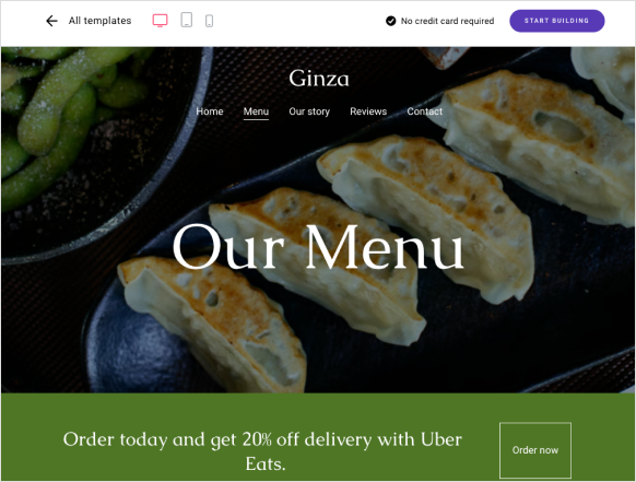
Ginza Food Website
Jazz FM
Jazz FM Romania’s website displays a bold triangular ‘play’ symbol that indicates that their website offers music. Despite the bright yellow background, the elegant black graphic designs is making the color scheme complementary. As a result, it is impossible not to click play to hear jazz.
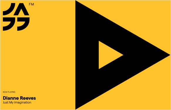
Jazz FM Romania
What are the advantages of modern and minimalistic web design?
Let’s have a look at some of the advantages of modern minimalistic web design:
Easy to Use
Websites with simple interfaces are easier to navigate for users. It is easy to read the results because they are organized in a logical order. Easy navigation, clear text links, and CTA buttons help users to get the information as quickly as possible.
Good Accessibility
With the growing popularity of the internet, we are enabling more people to access the content. It is helpful for websites to provide instructions on how to use the internet for individuals with impairments, such as:
- Typefaces that are legit
- Strong iconography
- Use of contrast effectively
SEO Friendly
Minimalist design is SEO-friendly because it enables search engines to quickly and easily read your website’s content. Search engines reward websites with clean coding and optimized mobile app design services. So, a simple website backend is an obvious choice for an SEO-friendly site.
Content Focus
Minimalist design mainly focuses on the content, rather than the website appearance. Rather than anything else, the focus of the site should be on what it offers, and that should attract visitors’ attention first. The user should get your website’s main message as quickly as possible when scanning through it. The content is organised in spaces that improve readability by using vivid contrast between the images, text, and white background. Also, one can use a better microcopy of content to attract visitors
Microcopy
Works on all screen sizes
As mobile devices become more popular and their screen sizes grow, many designers see minimalism as a solution for better compatibility between different screen sizes. Minimalism is a design philosophy that works on desktop computers, mobile devices, and even wearables. It is compatible across platforms and has become a significant aesthetic trend.
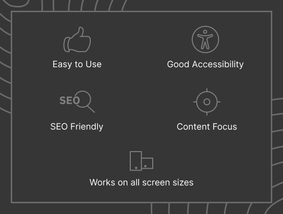
Having a minimalist website design makes it easier to use, more accessible, and easier to scan. As a result, the user has an amazing experience.
What are the challenges in minimalistic web design?
The concept of minimalism is not easy to master. A minimalistic interface can often be difficult to use, requiring the designer to invest additional time and effort to make it usable. When you are designing a minimalist website, you should consider the below points.
Simple but not limiting
Design elements such as visual indications and elements for interactions or navigation have been removed by some designers to achieve a minimalist aesthetic. They have made the interface cleaner but introduced complexity that will make the product harder to use for visitors.
A common example of this problem is hidden navigation. Designers leave some users lost in the journey when they hide navigation objects behind UI elements (such as a hamburger menu).
Simple but not primitive
To make a design minimalist, the content and features should be clear to the user, not hidden or removed. Keep your website users engaged by providing them with the information they need right away by using clickable image cards with summarized information. By using certain design approaches, it can be achieved.
Final Words
The concept of doing more with less is complex. The key to being a successful modern minimalist web designer is to find a balance between user experience and simplicity. While it may take a lot of practice, every minimalist UI UX designer follows the same principles. At first glance, minimalism seems very simple, light, and user-friendly. Our web design services will never sacrifice functionality for aesthetics and always try to make it more efficient.
Thank You!


3 comments