
Typography is a set of techniques to arrange the text that makes the written information legible, and visually appealing. Following some basic typographic principles can make a significant difference in the quality of communication between the writer and reader. Good typography can communicate the tone of the text even before the user consciously starts to read the content, this is achieved by using appropriate typefaces and/or colors.
Typography Vocabulary
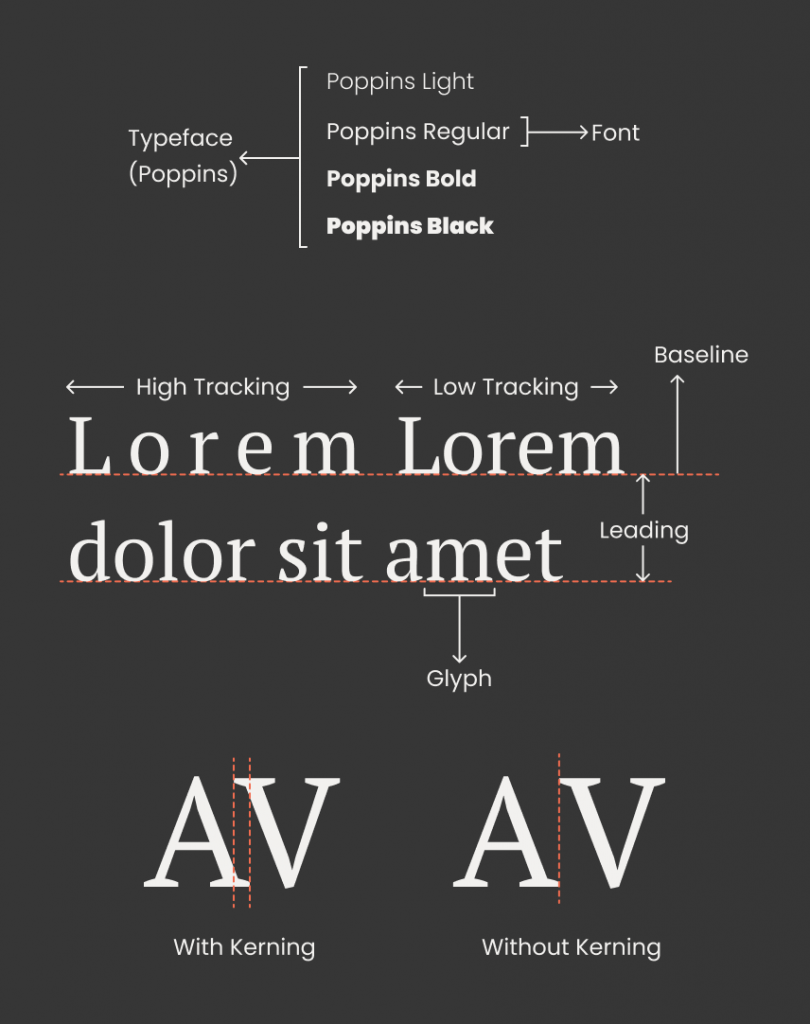
- Typeface and Fonts: Both of these words are often confused and used interchangeably. The typeface (also called type family) is a set of “fonts” that share a common design language and features. For example, Helvetica is a typeface comprising of fonts like Helvetica Bold, Helvetica Regular, Helvetica Light, etc.
- Glyph: Glyph is the smallest non-divisible unit of a font, it comprises letters, numbers, and all the symbols we use while writing a piece of text.
- Baseline: The baseline is the horizontal, parallel lines on a page that we rest our letters on. When the piece of text in question is digital or printed, the baseline is invisible.
- Leading: Also known as line spacing, leading is the distance between the baseline of two adjacent lines of a text.
- Tracking: Also called letter-spacing, it is the even space between letters, Tracking is adjusted to change the visual density of the block of text.
- Kerning: Often confused with tracking, kerning is spacing between two specific characters (called kerning pairs). Each font has a default space between a pair of characters which is not necessarily consistent, but it looks visually consistent because every pair of characters fits together differently.
Principles of Typography
- Color: Color is the very basic element to be taken into consideration when working with text. The most important aspect is the color contrast between the text color and the background color. Less contrast can lead to serious usability flaws in the design and may cause mental fatigue as the reader tries to decipher the words.
- Consistency: It’s best to limit yourself to just one or two typefaces per project. Too many typefaces will make the design messy and confusing. If the variation is needed, you can experiment with fonts of the same typeface and playing with sizes.
- Hierarchy: Hierarchy is the usage of different weights, sizes, and/or completely different typeface to guide the reader’s attention to whatever is most important, and then leading them to the next most important text block.
- Contrast: Contrast in typography refers to the visual difference in size, weight, and typefaces between two adjacent levels of a text hierarchy. A small difference between styles of heading and the paragraph equates to low typographical contrast and will diminish the advantages gained by establishing the hierarchy.
Conclusion
Typography may seem overwhelming at first, but things do get intuitive as you start noticing the work of others and your own. Good typography can make a difference between an ordinary design and a captive one.
Be the first to comment.