
In research on the use of color psychology in eCommerce websites, 92% of consumers (reference taken via Shopify) stated that the color of a product is the primary factor in their decision to purchase it. Balanced colors and design will help you with this. To achieve good sales or website surfing, you need to work on your website color and make it attractive.
The website color is the main factor in making an attractive website design. So you need to be wise about choosing colors for your website.
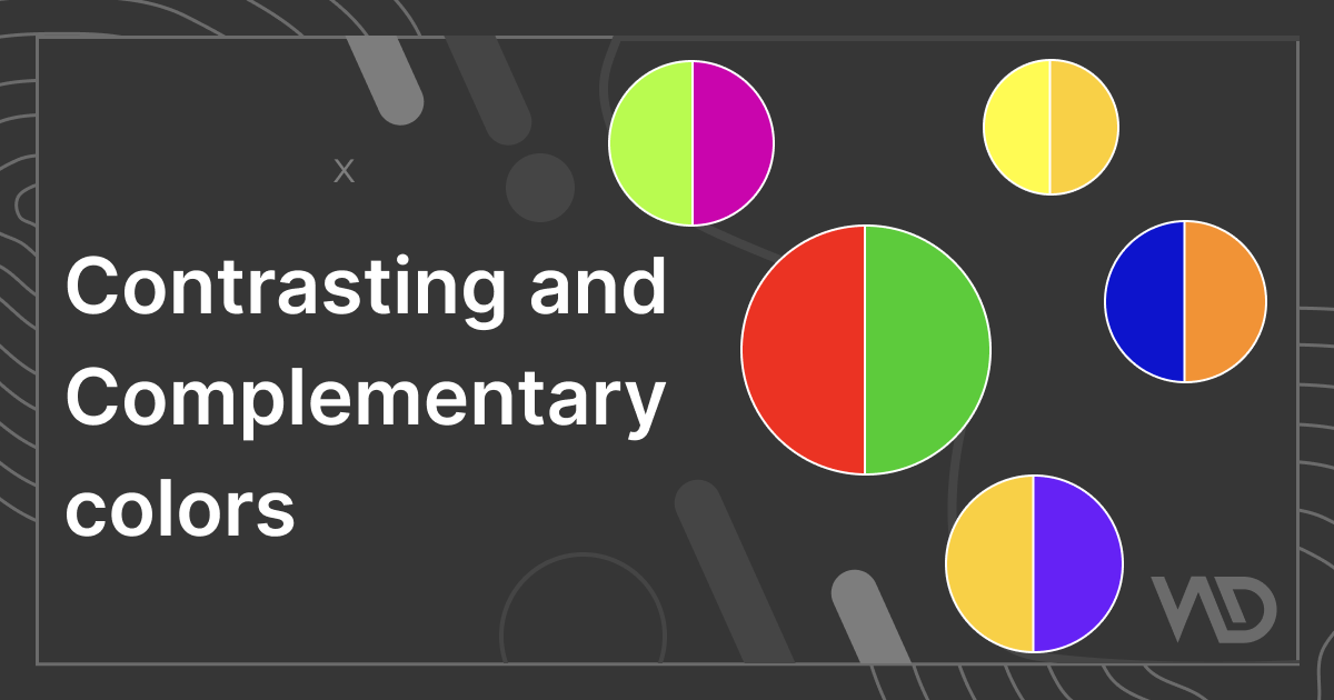
To begin with contrasting and complementary colors, you need to understand what contrast and complementary colors are.
Contrasting Colors
Contrasting colors are different from one another depending on where they are on the color wheel. For example, on the color wheel, shades adjacent to one another have low contrast, whereas colors immediately opposite to one another have high contrast.
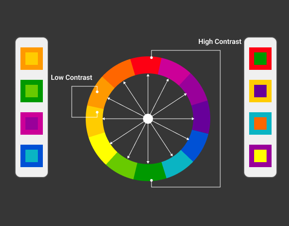
Contrasting colors explain the contrast between the image’s lightest and darkest tones. A balanced image requires both types of contrast, and understanding how to modify each type during the editing process is crucial for the overall quality of the image.
Complementary Colors
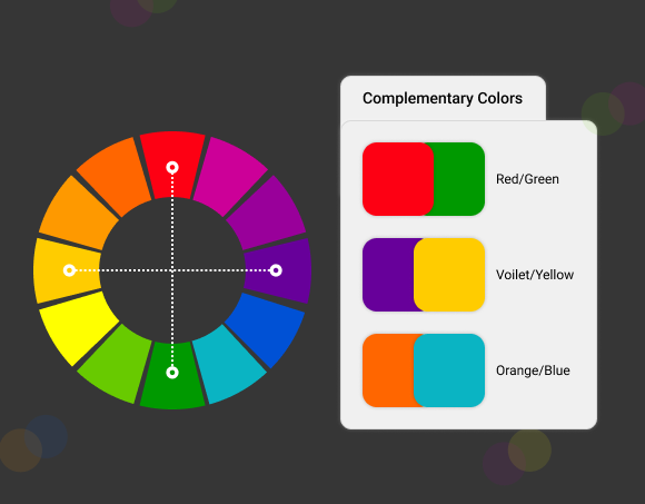
Two shades from the opposite side of the color wheel are used in this particular color scheme. It produces a color combination with great contrast that is vibrant and eye-catching. Complementary color combinations include orange and blue, yellow and purple, green and magenta, and red and green.
Particularly if you combine each shade at its maximum saturation, the strong contrast of complementary colors can be very stark. When it comes to design, you must carefully consider which of the two colors will be the prominent one because this color scheme combines warm and cool hues.
It’s important to choose the primary color and use the secondary color for accents when implementing a contrasting color scheme. This selection will determine whether your design will seem warm or cool in the end. Few designers opt to employ softer, warmer tones and less saturated colors, which softens the contrast while maintaining the composition’s balance.
How to create complementary colors?
Firstly, you need to choose any color of your choice and then use joining colors and mix them to create a complementary color. We can take the color from the color wheel, which is the most needed part to create new colors by mixing them together.
If you want to make warm colors, you need to choose some dark shades with slight light shades so it will give you bright colors, and if you add dark shades, then it will come up with dark colors. You need to add tint, shade, and tone to get the proper shade.
Double complementary, triad, complementary, and split-complementary color schemes are used to define four contrasting colors.
How to Choose Colors for your Website?
When you are choosing colors for your website, you need to think about your brand as well. When you choose contrasting colors, they should be eye catchy and attractive. Here are some tips for using colors on your website.
1. Choose colors that represent your brand, not just your online business.
The color palette must be the same throughout all of your corporate materials. I am referring to some examples like business cards, blog design, and social networking. For example, The Los Angeles Lakers are easily recognized because of their traditional purple and gold outfits. They use all Merchandise, social media posts, commercials, uniforms, and other materials with their brand colors.
To have a better understanding of how contrasting colors and complementary colors could represent your brand identity design services, use the following questions as prompts:
- Explain your business, what you do, and for whom you do it in a single sentence.
- Consider one term that best sums up your ideal client.
- What impression do you want customers to have of your company?
- What issue do you resolve for clients, and how do they feel once you do?
2. Consider color psychology
You need to understand color psychology to understand customer choice. Before any sales conversation, the appropriate colors can aid customers’ thinking and set their emotions. For example, if you want to purchase some makeup products, then you must check the colors of the website, and it should be vibrant and appealing for women so they will buy it often.
3. Identify Visual Hierarchy
Visual Hierarchy is based on the content of the website, like font color, size, background image, and colors. If you use different colors on the heading and subheading, then it will look more reflective and identical. Almost every visual element on a website is subject to the design premise that color palettes determine visual hierarchy.
To identify the visual hierarchy, you need to understand your product uses and targeted audience so you can use fonts and colors accordingly. You can use online CSS code generators to create the border-radius, fonts, transformations, backgrounds, box, and text-shadow styles.
4. Try to Get User Interest
Users are attracted to websites that have responsive designs and colors. It can generate interest, create desire, increase conversion rates, and even win over customer loyalty. When executed correctly, excellent color selections can influence how visitors interpret what they see just as much as layout and copywriting.
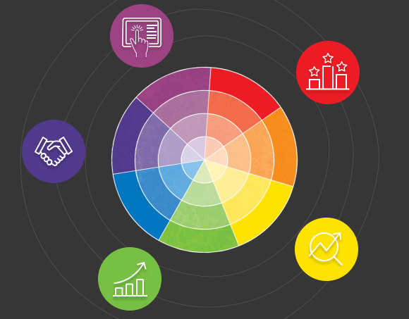
Benefits of Contrasting and Complementary Colors
1. Improve User Interaction, Website Engagement, and Enhanced sales
The vibrant colors improve website user involvement. It results in a number of advantages for the store owner, including successful sales, enhanced website performance, improved customer experience, and so forth.
Human psychology drives people to buy products when attracted to enticing colors and designs. When a store owner uses vivid colors in their store. It attracts users to explore the website and will stay on your website for a while.
When you include all factors like user interaction, standing out between the competitors, highlighting important information, and enhanced performance. All these factors tend to improve sales. There is a vital role of colors to build your website, which attracts users to purchase the product, and also you can get extra income via enhanced performance and less cart abandonment.
2. Be Different From Your Competition
If a store owner wants to run their store in this competitive world, they need to do some work on their website and try to be different from their competitors. Owners can use unique designs, themes, offers, multiple product options, and so on to achieve these criteria.
- Vibrant colors allow designers to create unique designs.
- Special fonts facilitate owners to create an attractive theme.
- Multiple color options on their products and offers will also attract users.
3. Highlight Important Information
When you use vibrant colors to highlight any information on your website, it will reflect clearly. So the customer can get the visual impact easily. The store owner can use contrasting and complementary colors to highlight offers, terms and conditions, coupons, restrictions, and so on. You can use some mix-and-match colors to highlight some specific parts.
Some of the Latest Color Combinations Examples
Here are some latest color combinations based on contrasting and complementary colors for your website.
1. Earthy and Natural
If you want to create a website related to nature, like a plant nursery and fruit vegetable shop, this color scheme quickly prompts thoughts of being surrounded by a soothing blue sky and a loving scene of the outdoors. This lovely color scheme is perfect for projects that focus on sustainability and the natural world, and it may be useful for those businesses that promote environmental awareness.
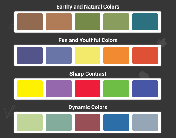
2. Fun and Youthful Colors
If you want to create a website for kids or any games, you can choose some youthful color combinations like purple, red, baby pink, and so on. To create a website that will provide an enthusiastic impact on the users, and they will explore it more.
3. Sharp Contrast
The website owner can use sharp contrasting colors for their fashion website, image creation website, paint website, and so on. All these variants use intense shades and tints for an attractive look. You can blend a few basic colors like dark blue, teal blue, dark gray, and a few more dark shades. Blend them well in your design so it will look appealing and beautiful.
4. Dynamic Colors
The combination of dynamic colors is the combination of royal colors like magenta, charcoal, and green. This color scheme is adaptable enough to be used in multiple projects, from magazines and general journalistic material to professional-looking business reports. You can use this on your ed-tech website to provide a good learning experience to the customers. This will help them to engage themselves with the website and available content.
Summing Up
There is a vital role in contrasting colors and complementary colors while building your website. You can take the example of many big giants like clothes from Myntra, makeup from Nykaa, payments by the Gpay app, and so on. All these websites use colors based on brands, targeted audiences, gender, and products. This gives them a huge response from customers, and it will enhance their sales and brand endorsement.
You can create a website as per your choice and use the colors accordingly, but always try some mix and match with contrasting and complementary colors. So it will give you attractive combinations that can be used on your website representation.
Be the first to comment.