
Introduction
The term “Iconography” is made up of two Greek words, “eikon,” which implies “image,” and “graphe,” which implies writing. Thus, iconography enables us to communicate our ideas visually rather than using a thousand words. However, certain principles must be kept in mind while designing an icon to make it legible, consistent, and effortlessly understood by the viewer.
Basic Principles of Iconography in UI Design
Understanding the specifically designed symbols and motifs in non-verbal expressions is essential for studying iconography. To both design and interpret icons, it is necessary to be familiar with the meanings that are unique to each platform and culture.
For the creation of iconography in user interfaces, platforms like Apple and Android have their own set of guidelines. Before creating icons for these platforms, we should always refer to the following rules:
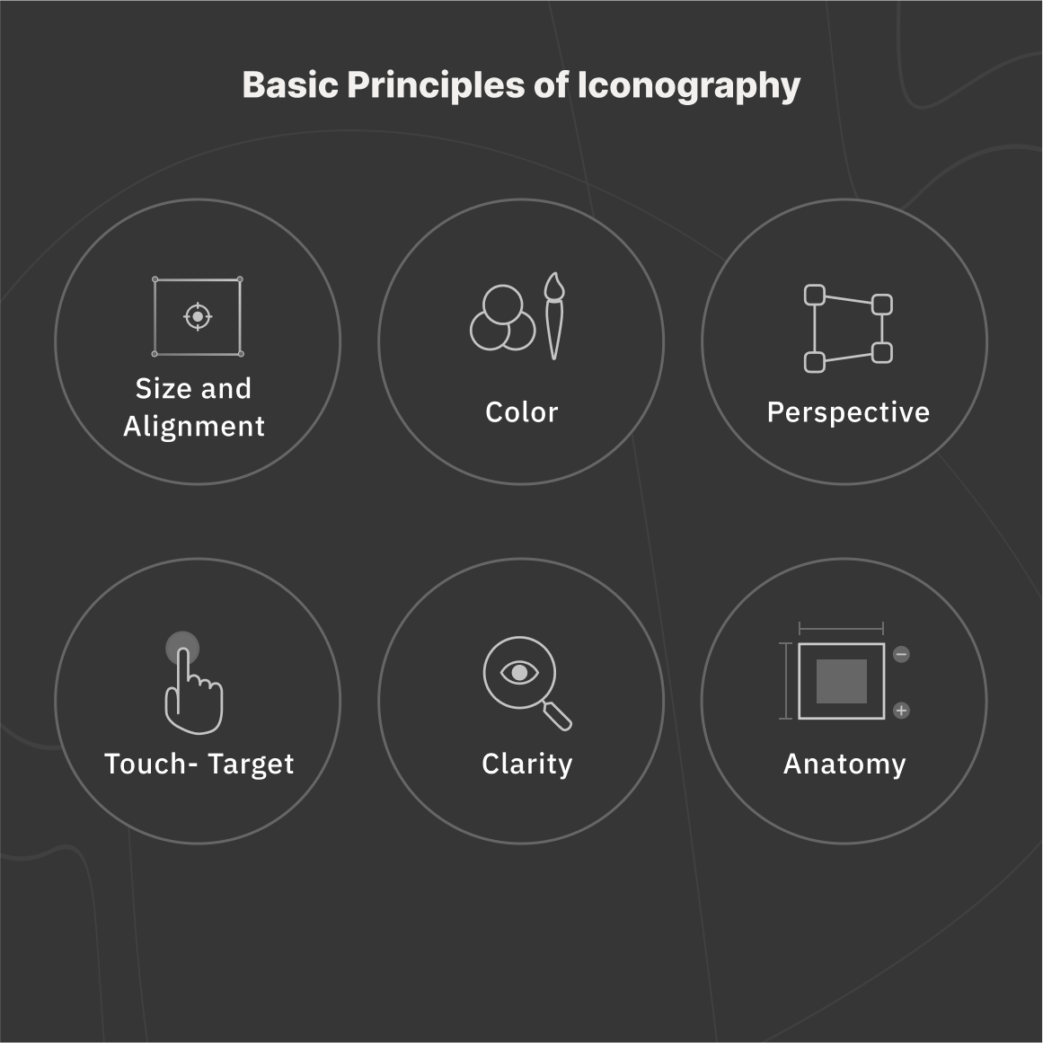
1. Size
Icons can be designed in a variety of sizes according to the needs and intended use. We may create and export icons in different resolutions using tools like Adobe XD and Figma. It is common practice to design icons at 24×24 DP and export them at the desired resolution. For instance, if we design an icon at 24×24 DP size and export it in 2X, the icon will be exported at 48×48 DP, which meets Apple’s standard size requirement.
Depending on the requirements, we may generate icons at 16×16 DP, 32×32 DP, 48×48 DP, 64×64 DP, 96×96 DP, 128×128 DP, 256×256 DP, and 512×512 DP.
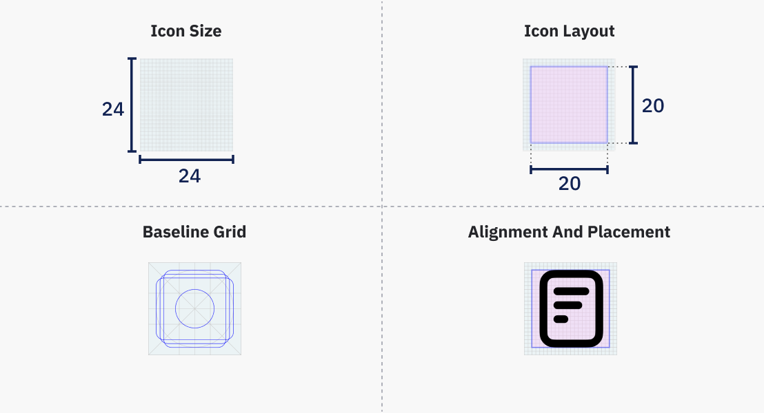
2. Structure
Four concepts must be kept in mind when creating an icon: grid, live area, trim area, and key lines.
-
A grid is made up of parallel lines that intersect each other vertically and horizontally. It helps with alignment and placement. On a 24×24 DP frame, it is common to construct grids of 1 pixel.
-
The live area of an icon refers to the part of the icon that is visible to the observer. We should put the icon inside the live area to ensure consistency in size. If we are designing an icon that is 24×24 DP in size, we should ideally position that icon in a 20×20 DP live area.
-
The trim area is the space between our base container and the live area. For example, when creating an icon of 24×24 DP with a live area of 20×20 DP, we leave 2-pixel padding. Icons should not go out of the trim area.
-
Key lines are used for consistent placement and alignment of icons in the user interface. It usually consists of circles, squares, rectangles, orthogonal, and diagonals.
3. Color
Colors are important in user interface design. It helps in providing a pleasant experience and establishing a brand. It is recommended to use clear, monochromatic colors for icons to maintain uniformity and user-friendliness. Colorful icons can create visual noise and confusion when applied improperly.
In iconography, different colors can be used to denote an icon’s active status, inactive state, disabled state, or other important UI functionality that might contribute to a positive user experience. When combining an icon with text, the icon and text should have a 4:5:1 color contrast ratio and be the same color.
4. Pixelation
To prevent pixelation, the X and Y coordinates of icons should be in integers rather than decimals.
5. Dimension
Perspective-based icons require a higher level of detail and precision, and they can be harder to recognize at smaller sizes. For this reason, it’s best to design icons in a two-dimensional view.
6. Predictability
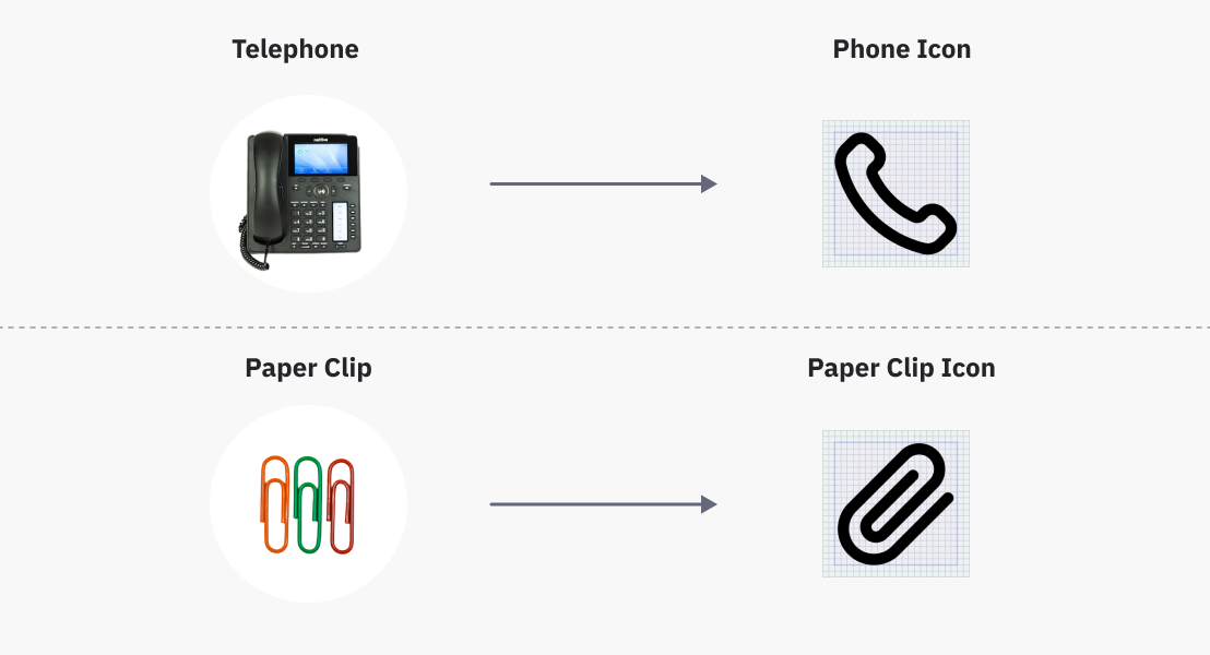
Icons are not merely made for aesthetic reasons; they have a function as well. Therefore, it’s crucial to check that the icon communicates the intended message to users. A user will have a terrible experience if they have to spend time trying to understand the icons or guessing what they signify. This will only cause confusion and irritation.
To stop such situations from happening, we can keep in mind the following factors:
-
Icons should be recognizable, meaning they should be easily seen anywhere. They must be striking, memorable, and predictable. For example, to show “call,” we usually create icons depicting the telephone. This is because users are familiar with these forms in their day-to-day lives.
-
To ensure that the message of our iconography is understood correctly, we can combine it with text.
According to Gestalt’s Principle of Similarity, humans tend to group like things together. As a result, we can organize icons into groups that have similar or related functions.
7. Touch Target
The sections or regions of the screen that respond to our input when we tap an icon are referred to as touch targets. The icon’s touch area is typically constrained on mobile devices for better mobile app UI design. Its utility can, therefore, be enhanced by leaving a touch space around it that is almost twice the size of the icon. For example, when designing icons for touch surfaces, all targets need to be at least 48 px or greater according to Material Design.
8. Anatomy
In a particular UI, the icons shouldn’t differ in weight from each other. We must adhere to a few fundamental rules to keep the icon weight uniform. It is recommended to make icons with a 2 px stroke weight. Internal, external, curves, and angles should all have the same stroke weight.
Additionally, the recommended corner radius for our icons is 2 px. When necessary to make the icon more understandable or the object shape clearly defined, the 2 px radius might be increased by a multiple of two. Icons with outlined inner edges should have squares rather than rounded corners.
Both the exterior and interior corner radii of the rounded style icons should be ideally curved, while the exterior and interior corner radii of the sharp style icon can vary from 2 DP to 0 DP.
9. Style
Icons can be classified into a wide range of categories, including skeuomorphic, filled, outlined, and glyphic icons. We must select the appropriate style before we begin to design the icons for our project. Also, we should stick with the suitable style we’ve chosen throughout the entire project.
Along with keeping consistency in icon style, we also need to maintain uniformity in our styling. For instance, our icon collection must ensure consistency in the stroke, detailing, corner radius, etc. We can switch between filled and outline icons to show active or inactive status and other functionalities.
Conclusion
We create icons to make it simple to communicate information. When designing an icon, it’s important to think about scalability and readability. For example, if the icon spacing is too close together or the strokes are too thick, it may not efficiently fulfill its desired objective and cause visual clutter. Additionally, icons should not be overly complicated or overloaded with unnecessary features. Basic design principles such as negative space, similarity, etc. can make icons clear and attention-grabbing.
When designing, consistency is key. Inconsistent icons will look non-harmonious and provide visual noise. Experience, form, and function are all interconnected. Any improvement or decline in any of these will affect other variables as well. We should always analyze the target audience, behavioral psychology, and semantics before designing our icons. Therefore, it is crucial to consider the basic rules of iconography to design aesthetically pleasing and useful icons.
3 comments