
Components are UI elements that a designer can reuse across a design project. Figma will update the copies of the main component every time there are changes made in the main component. These copies of the main components are known as Instances. Components speed up the workflow, provide consistency and make collaboration easier.
Before component properties, a user would have to make multiple variants of the components for different use cases. This was a very time-consuming and complicated process.
In May 2022, during Figma’s annual conference, they launched some new features, one of them being the component properties.
What are component properties?
Component properties allow the user to add design properties to a component reducing the number of variants. They define the interchangeable design properties of the element. To create the properties of a component, the user needs to make the element a component and then make a variant. We don’t have to make new variants for adding design properties to a component, which saves a lot of time and simplifies the process.
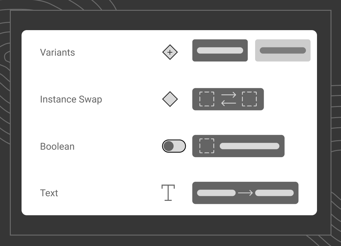
There are four types of component types –
1. Variants
2. Boolean Properties
3. Text Properties
4. Instance Swap
Variants
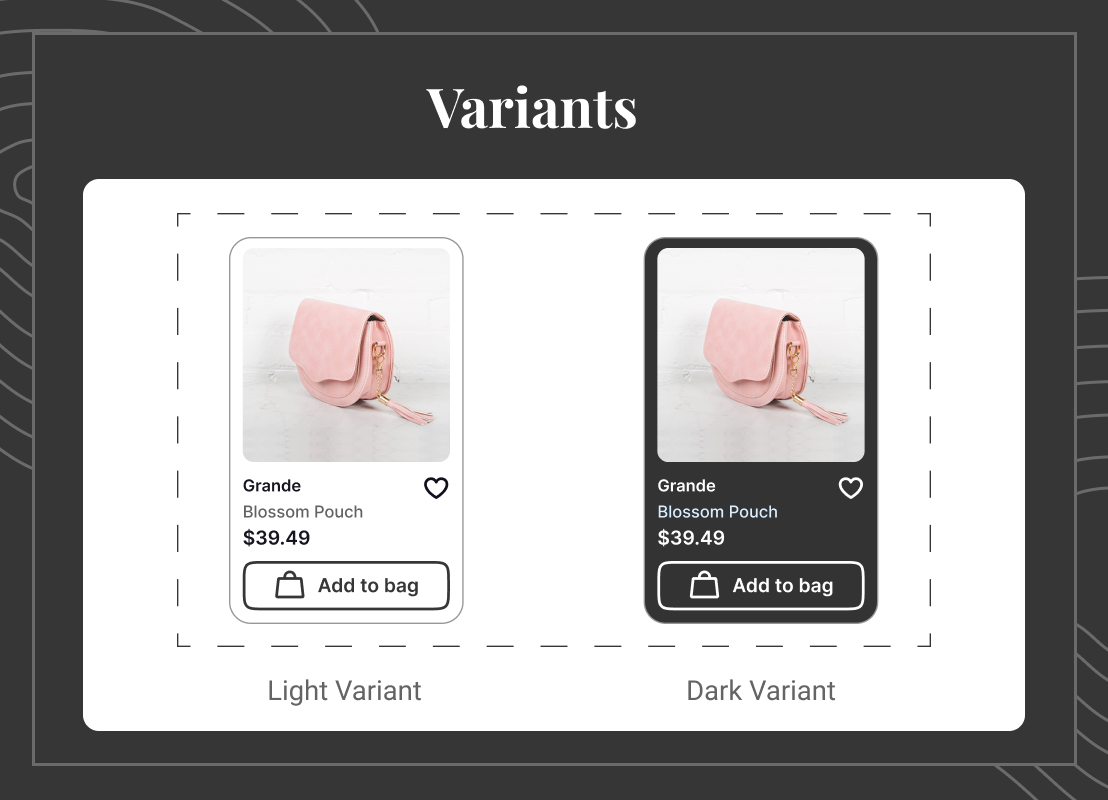
Variants bring a range of new possibilities to components and scalable design systems. The variant property allows changing attributes such as color, size, state, etc. For example, a button can have the hover, focused or disabled state. Before the release of the other component properties creating variants was the only way to add design properties to a component. If we increase the number of design properties applied to a component, the complexity of the variants increases and makes it difficult for people to understand.
Let’s assume that we are creating designs for an eCommerce application. We would have to make product cards to showcase the products. A product card on an eCommerce website can have a light variant and a dark variant; shown in the image depending on whether the website is in dark or light mode.
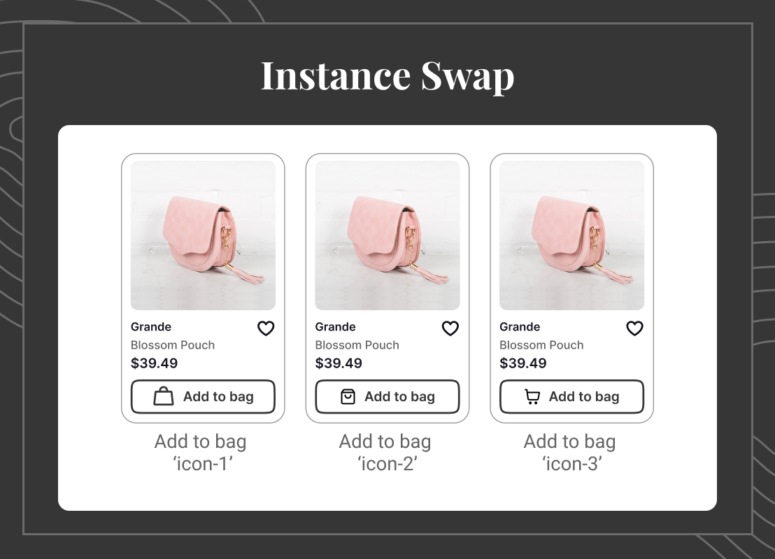
Instance Swap Property
In a component, the user can signify which instances are swappable. We can choose from the same component subset or the available library. To apply, select the instance which is swappable and then apply the Instance Swap Property. That instance can be changed from the component panel. The user can also choose a default instance, which will act as the placeholder.
The eCommerce product card, used in the previous example has a trailing icon in the button to which the instance swap property is applied. We can replace the existing icon with another icon from the component library.
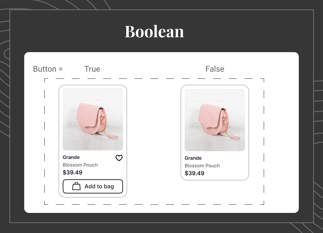
Boolean Property
A boolean property allows setting the value of a property as true or false. When the value is true the layer is visible, and when the property is false the layer is hidden. The toggle button in the properties panel switches the value. To apply the boolean property, select a layer in the component and add the boolean property to it from the properties tab. However, when an element is invisible, it might change the overall structure of the base element; users might need to confirm that they are getting the desired result after the boolean property to false.
The Boolean property applies to almost every element of the eCommerce product card. But for the sake of simplicity, we’ll apply it to the button element. When the toggle is off, the button element is not visible. The other elements act like it doesn’t exist and adjust themselves accordingly.
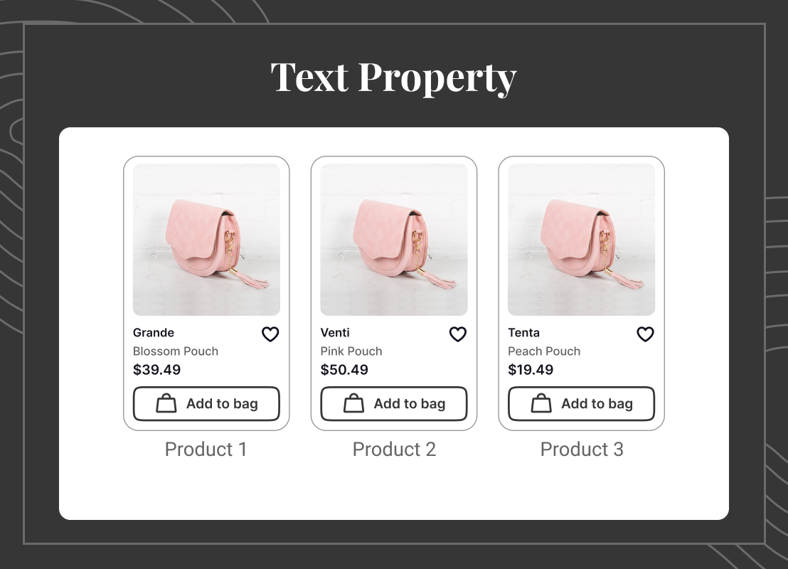
Text Property
The text property shows the editable text in a component that the user can edit from the properties panel instead of clicking until you reach the text layer. To create a text property, select the text and apply the text property from the ‘Content’ option in the property tab.
For our product card, the text property applies to the name of the product, the product description, and the price. To change the text we can go to the component properties panel and edit the text from the input field in the component panel.
Future Updates
The introduction of Component properties has been a success. Figma is now trying to add further updates to Component Properties to improve the user experience. Figma is offering beta access to some of the new features in the component properties. You can see how to get access to the beta version here. Some of the new upcoming features are as following-
Expose nested instances
If there is an element with multiple components where each component has its component properties, you don’t have to double-click the component to change its property. Instead, it will show as nested properties in the properties panel.
Preferred values
We can make a pre-curated set of components that we can swap using the instance swap property. Preferred Values help the user in identifying the instances which can replace the placeholder.
Simplified instances
Simplified Instances are layers that Figma assumes can be hidden since no component properties are applied to them. These are not visible in the component panel and help reduce the clutter.
Conclusion
Component properties save a lot of time in creating different variations of components. However, they might seem a bit overwhelming at first. With enough practice, I believe it will become easier for users to use them.
Large-scale design systems and UI kits benefit from this since their creators will be able to save a lot of time. They no longer have to create a different variant for every use case. With the reduction of variants, the design will look less complex and easy to use.
The best way to start learning Component properties is to open Figma and create a component in which all the component properties can be applied and apply all of them simultaneously. Then use an instance of the component and make changes from the property panel.
With some future updates, Figma will have the opportunity to make Component Properties much more beginner-friendly.
Be the first to comment.