
Grid helps us to align page elements based on sequenced columns and rows. Let’s learn how to use grids and layouts to give our designs a consistent rhythm and constrain decision-making.
What is a Grid?
In design, a grid is a system for organizing a layout. It forms the basic structure or skeleton of your user interface. The layouts can be used for print (like a book, magazine), or the screen (like a webpage, app, etc)
There are a lot of different types of grid, and they all serve different purposes. Here are some of the main examples:
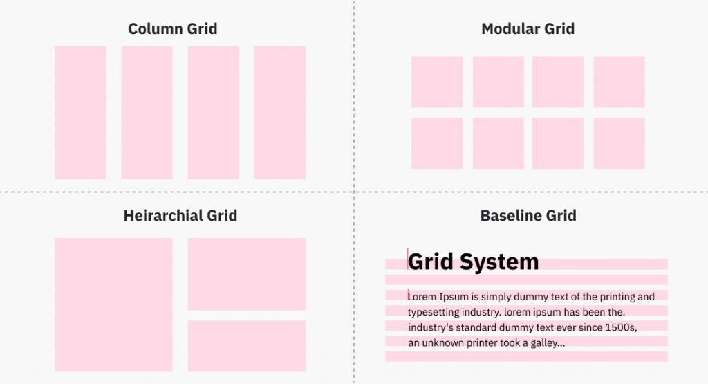
Column Grid: It is the most common type of grid used by graphic and web designers. They are composed of several columns, mostly used to organize multiple elements into columns. Column grids can have as little as two columns, with no real limit to how many there can be.
Modular Grid: Modular grids are composed of columns as well as rows. The intersecting rows and columns create “modules” that can then be used to govern layout decisions. They can be very effective for presenting many things at once for easy access.
Hierarchical Grid: Hierarchical grids, also described as “freestyle”, whose elements are placed “spontaneously” among the grid’s columns and rows. This refers to any irregular grid that accommodates specific content needs.
Baseline Grid: Baseline grid is used to set the leading from one line of text to the next for consistency. These are easier to organize, creates vertical rhythm, and are aesthetically pleasing. A sheet of ruled paper, like you, probably used at school, is a simple example of a baseline grid.
The 8pt Grid as a Solution
The 8pt Grid is one of the most commonly used Layout Grid Systems. Using an even number of columns like 8 makes scaling for a wide variety of devices much easier, and consistent. Also, the majority of popular screen sizes are divisible by 8 which makes for an easy fit.
The basic principle of the 8pt Grid is that you use multiples of 8 (8, 16, 24, 32, 40, 48, etc…) to margins, padding, and sometimes dimensions, on elements inside of your design. For a clear image, refer to image below.
There are two well-known versions of this system i.e Hard Grid & Soft Grid. Let’s look at both types of Grid below:
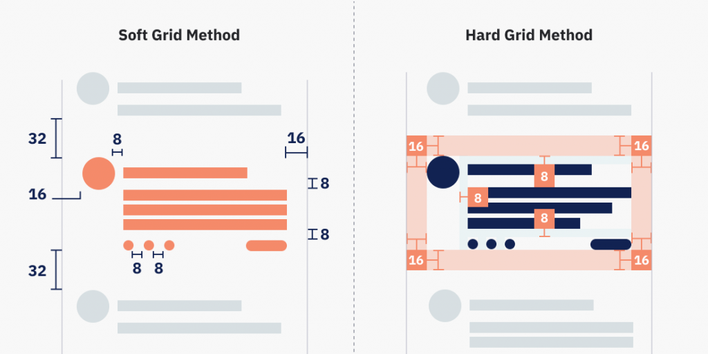
Hard Grid Method
In the ‘Hard Grid’ approach, elements are placed into a grid pattern defined in 8pt increments.
As you can see in the image below, the elements are sectioned and placed in relation to a higher container element in the hierarchy.
Soft Grid Method
In the ‘Soft Grid’ approach, you simply measure 8pt increments between individual elements in your design. As per the image below, you can see that the individual elements are positioned relative to one another instead of an actual grid.
Hopefully, with this brief overview, you’ll now feel confident in laying out your UIs faster with more consistency, less guesswork, and fewer design decisions required.
Thank You!
4 comments