
We are living in a digital era that is continuously growing and evolving. Cyberspace has become a common platform that is used everywhere with varied types of devices. New advances in changing digital product designs keep influencing users’ experiences. Designing a consistent user experience across devices can be a challenging task. It has led to the development of different approaches such as responsive and adaptive design.
What is Responsive Design?
Responsive Design was introduced by Ethan Marcotte in 2010. It is a modern web design and development approach. It enhances the seamless viewing experience with smooth navigation and content reading on the website.
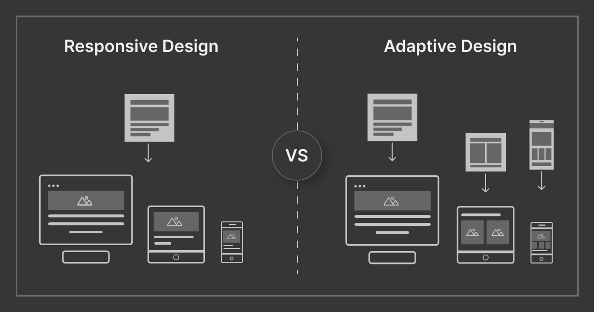
Responsive design addresses the challenge of creating user-friendly interfaces across various devices, regardless of screen size. This approach uses a single layout that adapts to the user’s screen size and device orientation. Elements like content, navigation, buttons, and text fields are adjusted accordingly to provide an optimal experience.
The Key Features of Responsive Design
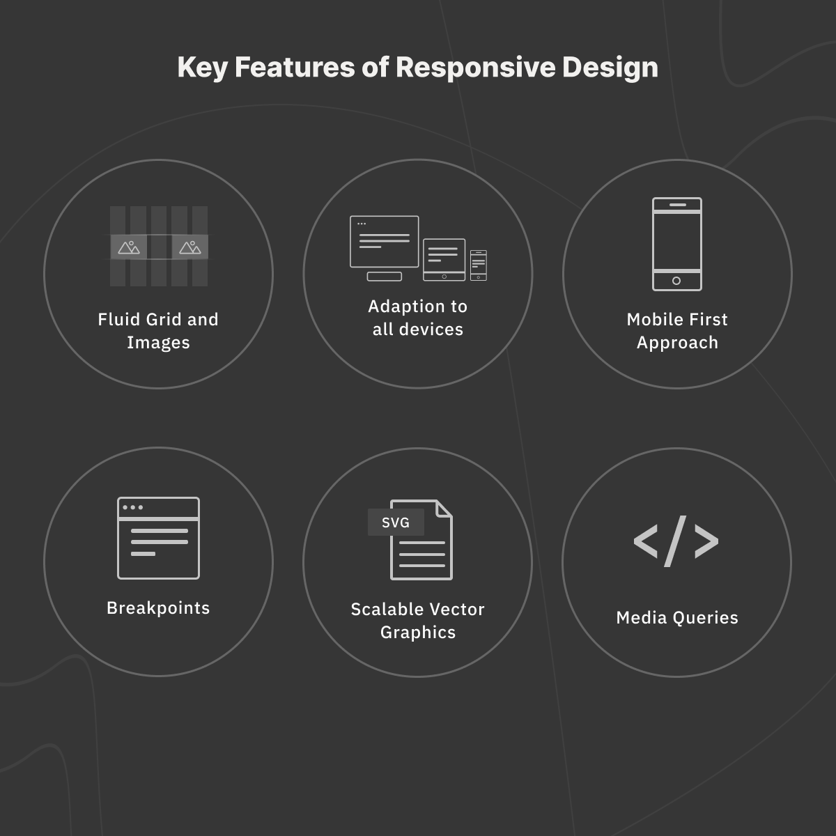
1. Fluid Layout
A fluid grid plays an essential role in responsive design. It has three major components namely:
- Column
- Gutter
- Margin
The elements of a page are placed based on these components. Irrespective of screen size, elements occupy the same percentage of space. To be consistent, we must specify the layout size and the positions where pixels should be. Since images are not fluid, inconsistency may crop up between devices as graphics might not adjust correctly.
2. Mobile-First Approach
The mobile-first approach suggests taking the mobile device as the first step in the product design process. The small screen area of mobiles makes it necessary to identify the most crucial information and give them top priority. Also, the hierarchy and relative sizes must be taken into consideration.
This gives us seamless navigation and improves the user experience for mobile app design services. While designing for larger screens, extra features may be added to complement the main functionalities.
3. Scalable Vector Graphics
SVG is a 2D graphic file format based on XML that supports animation and interactivity. Scalable vector graphics are helpful to maintain the resolution in responsive design as it changes according to image paths rather than pixels.
4. Media Queries-
Media Queries help in building responsive websites. It is a CSS method that can be used to improve the design for various devices.
With Media Queries we can:
- Add multiple breakpoints
- Hide elements for different screen sizes
- Change the font size of an element for various screen sizes
- Detect other factors about the environment the site is running on, for example, to check if the user is using a touchscreen or a mouse.
5. Breakpoint
A breakpoint is a set of screen sizes where the layout adapts or adjusts to accommodate different screens. Columns, gutters, and margins differ at different breakpoints. There are certain rules of thumb, such as user interfaces should adjust their layouts for the following breakpoints according to Material Design: 480dp, 600dp, 840dp, 960dp, 1280dp, 1440dp, and 1600dp. For responsive web design, it is wise to use content-based breakpoints as opposed to device-based ones.
What is Adaptive Design?
Adaptive design refers to a graphical user interface that requires the creation of different fixed layouts to adapt to various screen sizes and orientations. It is common practice to develop designs for the following viewport widths—320px, 480px, 760px, 960px, and 1200px.
When developing an adaptive design, it is crucial to keep consistency and use a grid with a consistent margin and gutter.
The Key Features of Adaptive Design
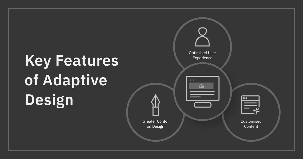
Target user research and analysis are crucial for adaptive design. This approach gives us more design control because layouts are built specifically for different platforms. Unlike a responsive site, the adaptive design looks more relevant and unique. It is tailor-made for different devices while keeping the user’s needs in mind. Therefore, such a design approach works well with a user-specific interface.
Choosing between Adaptive and Responsive Design
While designing, the target audience is the prime concern. Once we know the audience and the devices they use, it becomes easy to design for maximum user satisfaction. Uniformity and seamlessness prevent a user from getting confused and frustrated.
Both the strengths and drawbacks of responsive and adaptive design should be considered while making a choice.
- The adaptive design takes less time to load a page than the responsive design, although the responsive design is quicker to implement.
- While adaptive design supplies customized solutions, it is far more labor-intensive than developing a responsive design.
- Responsive designs are better for SEO as compared to Adaptive Design because of the possible duplicity of the content while creating multiple sites in adaptive design. Whereas in responsive design, the duplicity of content cannot be prevented, it can certainly help us tackle this common issue.
- Since in responsive design, the content adjusts to the screen size, page elements such as images and text sections may appear distorted.
- Adaptive Design is much more expensive as compared to Responsive design.
- Integration of advertisements in Responsive Design is difficult. Advertisements must accommodate all resolutions. As the website flows from device to device, the advertisements may fail to adjust properly.
In Summary, when providing website design services, it’s crucial to weigh the project’s constraints, including budget, time, and client requirements, against the size and complexity of the website.
The following are a few other factors that may be taken into consideration while choosing between adaptive and responsive web design:
- Which devices do web users use most often?
- When do we intend to publish our website?
- How much effort can we put into website maintenance in the future?
Conclusion
We have seen above that both responsive and adaptive design approaches have pros and cons. While designing, the user experience is of prime concern. A comprehensive and dynamic website is possible with any approach if the above-mentioned factors and design environment are given due attention.
Be the first to comment.