UX Friction is a term we use to describe any obstacle or inconvenience users encounter when interacting with digital products. These obstacles can take many forms, such as long forms to fill out, complex navigation menus, or unclear instructions.
When most people hear the word “friction”, they typically think of it as a negative thing. In some cases, friction can indeed be frustrating for users and lead to an experience poor enough to drive them away. Reducing friction in our products is one of the most fundamental ways of improving UX. We do that by lowering the cognitive load and shortening the processes, consequently making our products easier to use.
With all that established, there are still a lot of cases where intentionally adding friction can help improve user satisfaction. Some of those cases we will discuss today.
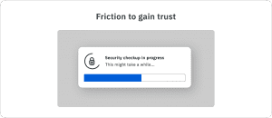
UX Friction to gain trust.
Our systems are sometimes too fast for users to believe. When important things happen instantly, users think that the process either didn’t happen at all or occurred with less than the required accuracy. So, artificial waiting needs to be introduced to fake the amount of time taken to process user requests.
Facebook allegedly used artificial waiting for its security checkup process. The process took only a few milliseconds on the server side to examine the privacy settings of the account. But on the user’s end, the process took several seconds to improve the perceived thoroughness of the process.
The trick is common beyond digital products. Most vacuum cleaners are louder than they need to be just to give users a sense of power. Customers think that if a vacuum is louder, it must have more suction power.

Friction as a filter
A lot of digital products make their onboarding process longer than they need to. This might be frustrating for some users. But it can also help ensure that only genuinely interested users access the site. This can lead to a more engaged and active user base, which can ultimately improve the overall user experience. Another path to achieve the same results is to block off core features of the product until users build a history of engagement with other less interesting parts of the website and app UI UX design . This can also give users a feeling of having earned access to core features ensuring even higher future engagement. This is a common trick used by forums where new users are required to engage with the community before being able to create new forum topics.
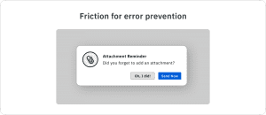
Friction for error prevention
Another benefit of UX friction is that it can help to prevent users from making mistakes or taking actions that they may later regret. This is especially important for websites and apps that handle sensitive information such as financial or personal data. By providing clear guidance and feedback, friction can help users to understand the implications of their actions and make more informed decisions. This can help to reduce the risk of user error and ensure that users feel confident and secure. The most relatable example of this is when Gmail prompts you to add an attachment to your mail if you have mentioned the word “attachment” in the email but haven’t added any. In this case, friction made the user switch from the subconscious style of thinking to the conscious style of thinking.

UX Friction to create engagement
UX friction can also be used to encourage users to explore a website or app more thoroughly. For example, a product that has a complex navigation menu may initially be frustrating for users. But it can also provide an opportunity for them to discover new features and content. This can help to keep users engaged and encourage them to spend more time on the site, which can ultimately improve the overall user experience.
Conclusion
In conclusion, while UX friction may initially be seen as a negative thing, there are cases where it can help build good UX. By carefully designing and implementing friction into the user experience, companies can guide users towards certain actions, prevent mistakes, and encourage exploration. Well-designed mobile app ui design use friction as a tool to establish control over speed and direction of user flow.


Be the first to comment.