The world today spends most of its time digitally. The Use of smartphones and computers has become a norm. We frequently use such devices to read articles, swipe up feeds on Facebook and chat with friends via WhatsApp. While performing such minor tasks, we don’t realize that we are contending with micro-interactions.
So, what are micro-interactions?
Micro-interactions in UX are single interactive movements in a product that are often unnoticed by the user. But these tiny animations make the product more delightful and easier to use. These tiny interactions are all around us. They are designed to boost user experiences. This is a big part of brand identity design services as it allows your brand to communicate with the user.
Breakdown of Micro-interactions
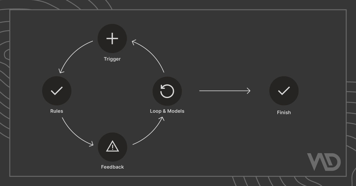
Dan Saffer, author of Micro-interactions: Designing with details, has derived micro-interactions into the following structure:
Trigger: The trigger initiates the micro-interaction. It can either be user-initiated or system-initiated. In a user-initiated trigger, a user interacts with the interface or performs some gesture or voice command. In a system-initiated trigger, the system triggers micro-interactions when it meets a certain set of predetermined conditions.
Rules: Rules define the flow of micro-interactions, once they are triggered.
Feedback: Feedback is a response to an interaction. It gives the user a signal like what is happening during a micro-interaction. Either the user has failed or succeeded at performing the task.
Loop and Modes: Loop and modes are conditional rules used in particular situations when the normal flow of micro-interaction is disturbed. Usually, they aren’t part of the initial design but are important for user satisfaction.
Why do Micro-interactions matter in UX?
The main purpose of using micro-interactions in UX is to provide feedback to users and keep them informed and engaged. Your user experience will likely suffer if you avoid adding micro-interactions to your design.
Sadly, many developers still ignore micro-interactions which cost their clients a huge loss. These tiny interactions add a bit of extra work for the developer. However, the results do pay off.
Well-designed micro-interactions are a clear sign of an exceptional website. Here’s why:
They make the interface more intuitive
If done right, micro-interactions in UX can boost usability. They constantly give feedback to users by letting them know that their actions have been successfully registered by the product.
For example, in an eCommerce website when you hover over the “add to cart” button on the product page. The button changes its color to let users know whether it is interactive or not.
Micro-interactions sometimes give feedback in audio form. You usually hear a sound on receiving a notification on your desktop or mobile phone.
Such tiny details make the whole user experience more intuitive and interactive.
They make you feel delighted
Imagine you are watching a video on YouTube. You liked the video and now you want to appreciate it. What will you do?
You click or tap on the like button. What happens when you click it?

The icon bursts with some splatter around it and the number next to it increases.
Such little animations are an example of micro-interactions in UX that delight the user. They may seem tiny but their presence makes the website more delightful.
Prevent users from making errors
The better approach to deal with the error-state condition is to prevent users from making errors. Such an approach makes the experience of the user safe and secure will using the product.
For example, Gmail’s automatic anti-phishing filter protects users’ data from phishing.
Uses of micro-interactions
Now that you know micro-interactions are a medium of engaging with users.
Let us see some of the examples of them impacting user experience:
Pull to refresh
Pull to refresh is a user-initiated micro-interaction. It lets a user pull down a list of objects when he wants to reload more content onto the screen or reload it.

Loren Brichter created a pull-to-refresh action for the Tweetie app. Later, thousands of apps all over the world adopted this functionality. The gesture makes the data update smooth.
Swipe Action
Swiping has become a common gesture due to touchscreen devices. Swipe action eliminates tapping. It is more smooth and more immersive. It lets the user explore different options quickly.

They can swiftly switch between the navigation or tabs and gain more information about the product.
Animations
Animation improves micro-interaction is a universal fact. Animations are great elements to add to a design. They look more aesthetic and intuitive. Also, make the whole process exciting and addictive at the same time.

However, when adding an animation to your design, you need to make sure whether it is functional or not. Else it can be sometimes frustrating to your users. It can also distract them from the main feature of the product.
Call to Action Button
In an online business such as eCommerce, a call to action button is the most important thing. To make your customers click on that button, you need to make sure that the experience is tempting and excites their interest.

Real-time system status
It is always important to let your user know what is happening inside the app or the website. Your user will leave your website out of frustration if they are not informed well.

Informing users about the system status is one of the tasks of micro-interactions.
Scrolling
We know that triggers initiate a micro-interaction. But do you know that you can trigger a micro-interaction by only scrolling down a webpage?
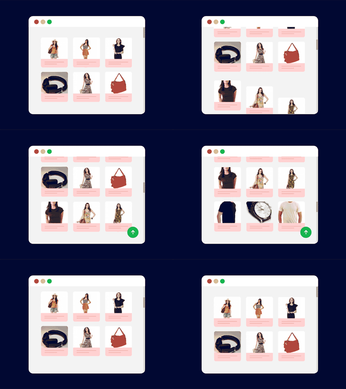
We often take scrolling for granted, however, it is the most common micro-interactions present online. The interaction occurs when you change your location on a typical page and it gives visual feedback to it. The scroll bar on the right-hand side of the page is a classic example of this type of micro-interaction.
Things to consider when using micro-interactions
We need to consider the K.I.S.S. principle when designing micro-interactions. K.I.S.S. means Keep it Simple, Silly. Every day, the user is bombarded with interaction whenever he or she uses a device or application. So to make their life simple, lessen the clutter of interactions.
Making them complicated could easily make your user go frustrated.
Micro-interactions in UX should follow a similar pattern that you have selected for your theme.
Best tools to create micro-interactions
There are several prototyping tools available in the market. However, if you are a developer who doesn’t know to use a prototyping tool you can still create micro-interactions by using the following coding tool.
- Web: CSS animation
- Mobile: Xcode
- Mobile: Android studio
- Mobile/ Web: Framer
If you are a designer who wants to create micro-interactions for web design services and mobile app design services, then you can use the following tools.
- Origami Studio
- Principle
- Adobe XD
- Protopie
- Figma
- Invision studio
Designers can use the above tools to create simple interactions such as drag-and-drop options.
Adobe After Effects is the best option to create micro-interactions having detailed interactions and for motion design services. With the help of this software, you can make your animation smooth and eye-catching.
Final Thoughts
Customers seek instant gratification. They are in constant need of it. As a result, they find a product more engaging if it involves micro-interactions.
Micro-interactions have the power to transform a good product into a great product.
No matter how tiny these details may be, their presence takes the whole user experience to a different level.
One must learn how to subtly add these micro-interactions to the design and make it relevant to the rest of the product.



1 comments