Before getting started with spatial memory let’s understand how human brain memory works. Humans have two primary types of memory long-term memory(LTM) and short-term memory(STM). After interacting with the data initially our brain makes the switch from STM to LTM depending on the usage. Now that we have basic idea, let’s get started-
Spatial memory is the ability of the brain to learn the location of the objects or components by interacting with them repeatedly.
Let’s understand with a real world example-
Imagine you’re making tea for the very first time. Definitely you’ll have a hard time finding the ingredients in the kitchen. But you eventually figured out all the ingredient’s locations and made the tea. You repeated this task for the next 6 days. Now imagine if the location of the sugar is changed on the 7th day. You’ll struggle, but in the end you’ll find a way. Now the sugar location is again changed on the 8th day and similarly on the 9th day. Here you’ll get mad and your complete process will be disrupted.
But what does it have to do with spatial memory?
Imagine your 4th & 5th of doing the task. You had complete control and the process was smooth. That’s because your brain developed the spatial memory about the location of the ingredients and when that location changed the spatial memory got neglected and the complete experience became worse.
And same experience is faced by user when UI elements keep changing frequently in digital interfaces.
Spatial memory comes into action when your product is shipped and your user has already spent some time with your product. Therefore, keeping long-term memory in mind can help a lot while designing for spatial memory. Let’s discuss some of the major factors which help in building spatial memory-
Avoid adaptive layouts
Adaptive layouts rearrange the interface according to the user’s screen size and needs. Various studies suggest that the practice of adaptive layout makes it harder to develop spatial memory because the location of the interested object keeps on changing.
In order to overcome this, we must reflow rather than rearrange. When switching from desktop to tablet view scaling down the UI elements is considered the appropriate approach because it preserves the user’s spatial memory.

Visual Cues and Landmarks
Visual Cues are an integral part of UI UX web design. Cues are the elements that draw the user’s attention to the areas of importance which eventually helps the user to interact with your product.
Visual cues and landmarks can be of various forms. An icon, CTA with good contrast, an image describing the content or a vibrant banner over the website can all act as visual cues and landmarks.
While designing keep an eye over the major action that you want your user to perform and accordingly specify your visual cues.

Spatial Memory vs Jacobs Law
Spatial Memory has more depth to it than Jacobs’s law. Jacobs law states that your system should behave like the other system or products are behaving. On the other hand, spatial memory is about remembering the position of the components after repeated use.
Lets understand with an example:
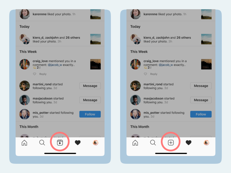
After introducing reels Instagram tested UI variants in order to promote reels. One of the change was where they replaced add new post icon with the reels icon in the bottom navigation and shifted the add new post icon to the top left of the screen.

During that period they tested different variants by switching the icon location in the bottom navigation and app bar.
According to Jacobs law, there is no issue because you’re placing your icon in the most prominent position like other products or systems. But still changing the position of the icon led to mild chaos and a bad user experience. Why?
Because every time the user opened the app the control trigger location for a particular task has been changed which neglected the spatial memory of the users. Hence, the bad experience.
Conclusion
Spatial memory plays a vital role in building task efficiency for repeated users and if spatial memory gets neglected it affects the overall product experience.
Also, avoiding adaptive layouts and usage of visual cues & landmarks helps the user to build and preserve spatial memory.


1 comments