The concept of PWA is very known to the market. Every online store owner needs PWA services. So what is PWA, and what is the role of design in PWA?
Mobile has the following issue.
- Need proper storage space
- Download app from the specific store – play store and apple store.
- Separate Development Process from scratch.
- The mobile app does not support offline.
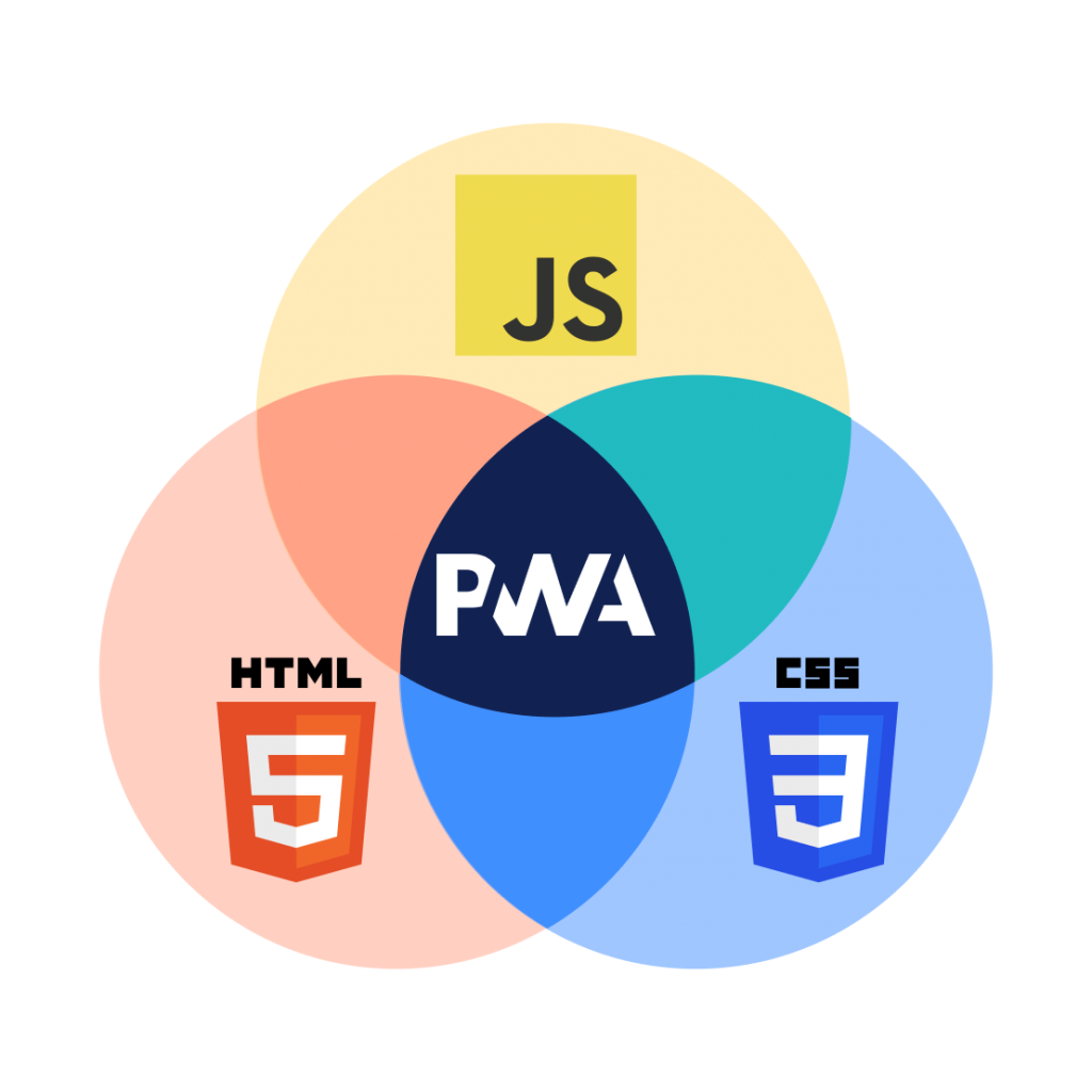
As we know, modern mobile browse are more capable of doing things with HTML, CSS, and Javascript.
Just think, If we can place an order through mobile browsers from an e-commerce store. Then what is the need for mobile applications?
Then the concept of PWA UX design comes. PWA uses your browser to render the page as an app using HTML, CSS, and JavaScript.
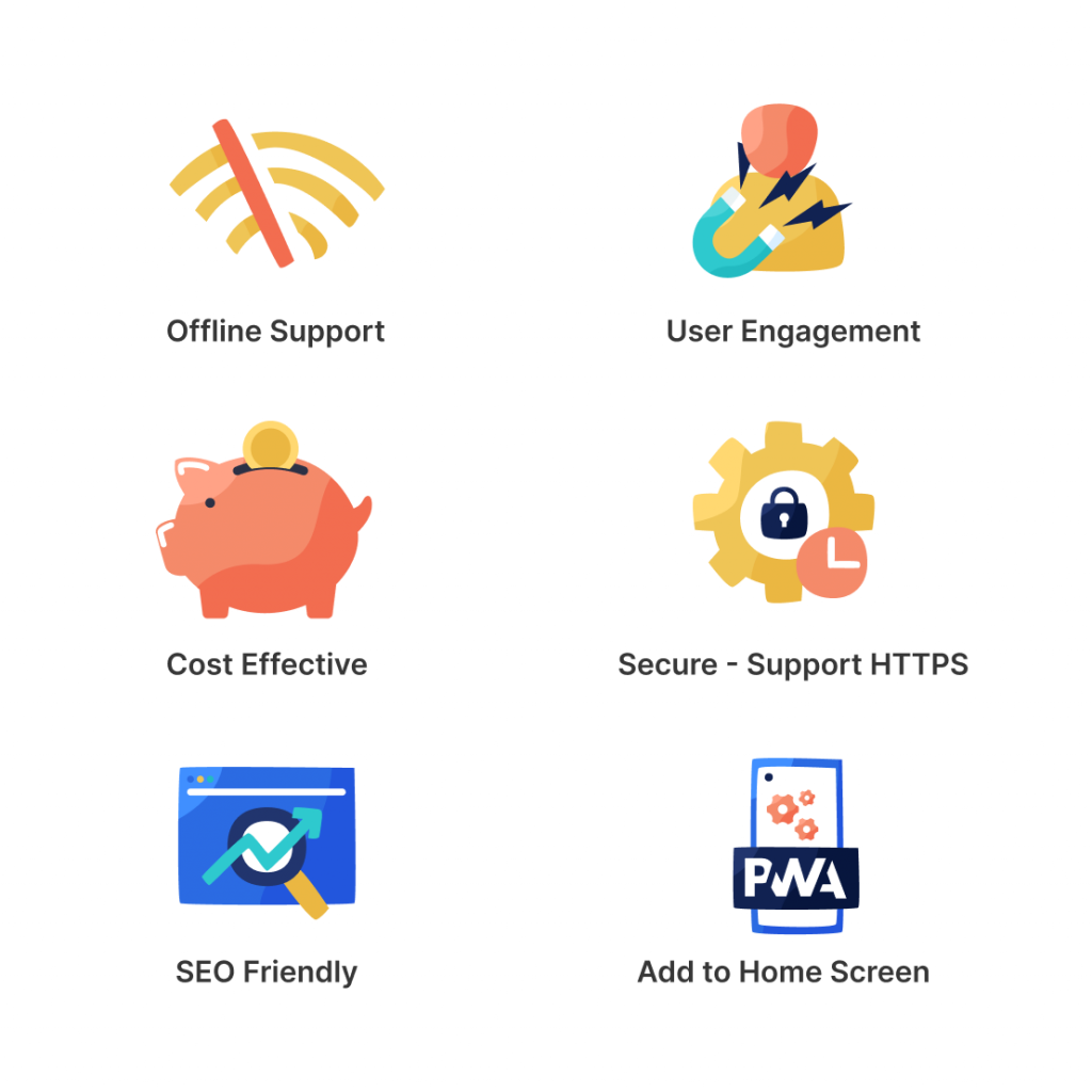
PWA is known for its feature, and basics are as follows –
- Offline Support
- High conversion rate.
- User Engagement
- Cost-Effective
- Secure – Support HTTPS
- SEO Friendly
- Add to Home Screen
- Light Weight App
Here the role of the designer comes while designing any PWA –
Page-Layout –
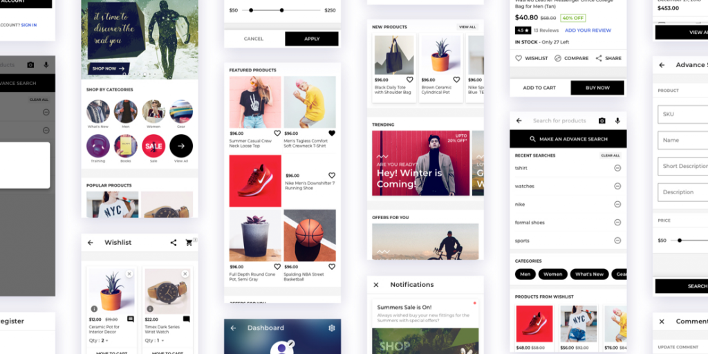
Follow the material guidelines for designing any page. Material guidelines provide a consistent layout across the devices.
App Icon –
Which show on the desktop after installation. Developer needs a single icon following sizes 72x72x, 96×96, 128×128, 144×144, 152×152, 192×192, 384×384, 512×512 (in px) and a favicon icon.
Background Color –
The designer defines the background color for the app, which show for 2-3 section with the app icon when the page gets load.
Accessibility –
All controls (Elements) are accessible by mouse, keyboard, and touch. Give proper padding and margin around the element.
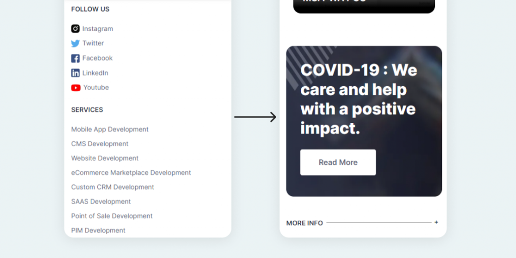
Accordion Footer –
The full view footer in PWA is irritating. So you can use accordion for the footer or use bottom navigation.
System Font-
Use system-fonts because they easily render. System font gets render without any request.
Optimze Image-
Use Optimize and interlace image so that page fastly render.
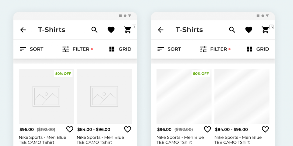
Use image placeholder-
In lack of image, placeholder layout gets scattered. You can use a normal image or add a shimmer effect. It is better for the user experience.
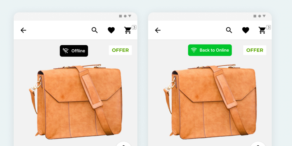
Network Notification –
Notify users about the online and offline switch.
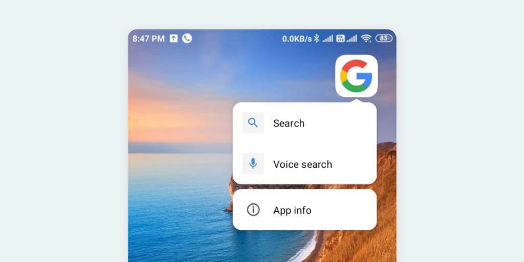
PWA Shortcut –
Shortcut also can we added in PWA. Add icon befor the text in shortcut. Icon size of shortcut is 96×96 px.
Now a day, for better user experience, PWA supports various hardware supports like –
Media capture, Geolocation, Notifications, Contact picker etc for full details you can check out at What PWA Can Do Today
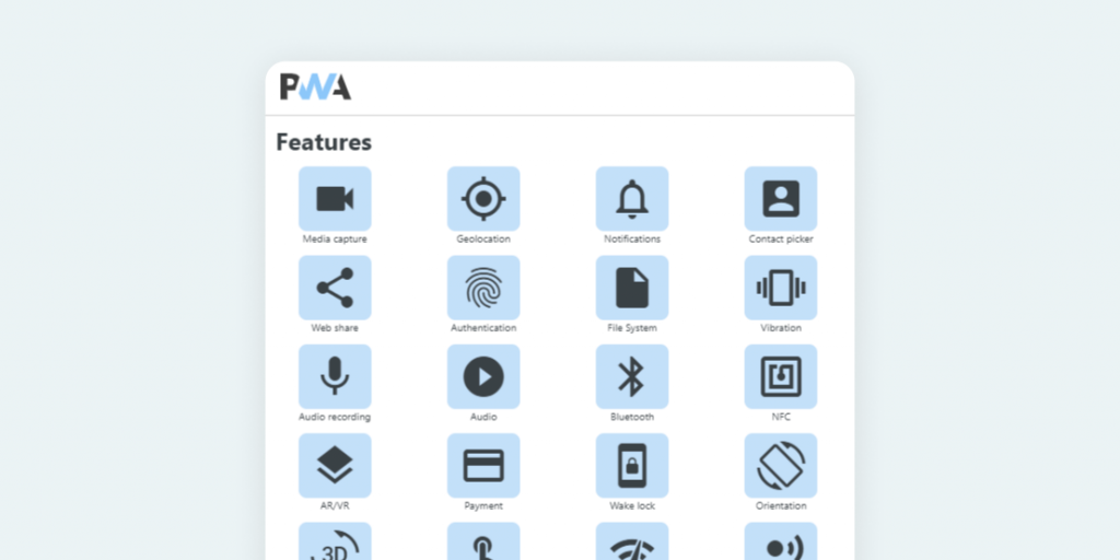
There are many other terms use in PWA like Service worker, manifest, etc.
but I cover is only the basics of PWA as a designer.
Thanks you, to see you here 🙂


1 comments
multi vendor ecommerce platform